Guest Post By: Juul Coolen
The web, and consequently its visual appearance, is dynamic by nature. For one, browsers interpret pages and show them accordingly. In a standards-compliant world every browser would adhere to the standards as set out by the W3C so pages look the same in any browser, but we all know the actual state of affairs. Granted, things have significantly changed over the last couple of years. ‘Bad’ browsers are phasing out (albeit slowly), handing over control to the designers by means of CSS. Which doesn’t mean total control, though. Especially when (enviously) looking at the area of print, there is one facet in particular we would love to be able to borrow: typography in all its glory. Or the way Jeffrey Zeldman puts it:
"The less sophisticated lament on our behalf that we are stuck with ugly fonts."
Image Replacement
Web typography is different from printing typography in that a CSS font rule is merely a request to the browser and therefore open to interpretation. Which poses a problem when the specified font is not available on the client’s computer. In such case the browser software is more or less free to pick a substitute font. Even so, font rendering varies across browsers and platforms, and user-defined style sheets can overrule any font specifications. Web standards have yet to be developed for hyphenation, multi-column text layouts, embedding of custom fonts… and the list goes on. To bridge this gap between print and web, and the time it takes for the W3C and eventually browser vendors to support these standards, people have come up with their own ways of getting in typographic control.
Image replacement is probably the most straightforward way of realising (some of) this control. In a nutshell, image replacement is about using CSS to hide HTML text and displaying an image instead, maintaining SEO. Therefore useful for branding purposes, giving the ability to have for example headers with distinguishing fonts and, possibly, effects. Several image replacement techniques have emerged over the course of the years, each one trying to overcome the downsides of others. However, none of these techniques have proven to be without their own share of flaws.
Fahrner Image Replacement (FIR)

The original image replacement technique by Todd Fahrner. Below the CSS implementation:
h3 {
  background: url(header-replacement.gif) no-repeat;
  width: 200px;
  height: 40px;
}

h3 span {
  display: none;
}

<h3>
  <span>Replaced header</span>
</h3>
As easy as image replacement gets. The CSS hides the text wrapped inside the span tag and subsequently replaced by the background image of the h3 tag. Problems with this method however are the inaccessibility for screenreaders, the inaccessibility with images turned off (and CSS on), and the loss of typical text behaviour (i.e. selecting/copying/resizing).
The screenreader problem got resolved by Mike Rundle who used a large, negative text-indentation in substitution of hiding the text. Making the text invisible for human readers because of the position outside of the viewport, but visible for any automated source readers. Still, the problem when images were turned off remained. The latter was finally adressed in the so-called Gilder/Levin method, by layering an image on top of the text instead of behind it. That way there is no need for CSS to hide text (getting around the screenreader problem), plus when images are turned off the text underneath it simply becomes visible (remaining accessibility).
h3 {
  position: relative;
  width: 200px;
  height: 40px;
}

h3 span {
  background: url(header-replacement.gif) no-repeat;
  position: absolute;
  width: 100%;
  height: 100%;
}

<h3>
  <span></span>Replaced header
</h3>
Although the Gilder/Levin method works like a charm and hence looks like a viable image replacement option, some other issues remain (besides the non-semantic span tag). The most important ones not being able to select, copy and resize the text and secondly the inability to easily alter the text, which is now enclosed in an image.
(Scalable) Inman Flash Replacement (sIFR)

While the above methods replace text with images, IFR and its successor sIFR do so by using Flash. IFR is a product of both Shaun Inman and Mike Davidson, the latter continued development (together with Mark Wubben) on sIFR. sIFR is essentially a hybrid image replacement technique since it uses Flash, JavaScript, as well as CSS to perform the replacement. The JavaScript grabs assigned elements in the HTML document and swaps these out with a Flash file, which contains a pre-defined, embedded font. CSS can be used to further style the text.
The power of the technique lies in the ability of Flash to include fonts in its files. The text is also selectable and degrades gracefully when the replacement for whatever reason fails. sIFR is quite easy to implement and I would like to suggest this tutorial at Nettuts for a quick and to-the-point introduction. Downsides of the sIFR technique are increased load times, possible processor strain and its reliance on the Flash Player.
Facelift Image Replacement (FLIR)

Quite similar to sIFR, but with a twist, is the PHP-based FLIR. Image replacement is performed by server-side scripts in conjuction with JavaScript and CSS. The general advantage of FLIR over sIFR is that it is not platform or software (Flash) dependent. From that point of view FLIR offers a different approach by using regular images generated server-side. However, as with simple FIR, the property of text selection is lost.
The Future of Web Fonts: CSS3
We have been using CSS2 for quite some time now, actually it was published by the W3C as early as May 1998. To frustration of most, we are even today experiencing its anomalies in browser implementation. CSS level 3 seems to be around the corner as the W3C is actively working on its roadmap, but full software support will probably take some iterations. That doesn’t mean though we can’t have a look at what lies ahead.
Most noteworthy new feature is what the W3C dubbed the Web Fonts module. And in particular its @font-face rule. This rule lets you specify a custom font like so:
@font-face { font-family: "Rockwell"; src: url(rockwell.otf) format("opentype"); }

h2 { font-family: "Rockwell", serif; }
Two different contentions have arisen though: which font file format to support (TrueType versus OpenType) and a rights management subject. A more elaborate discussion regarding this can be read at Ars Technica. Once again different interests are involved, such as the proprietary formats and implementations of the main browser vendors. Thankfully though, the parties seem to be more and more converging towards standards. Something that is needed to hand over even more control to the designer in the future.
Conclusions & Best Practices
The dynamic nature of the web makes it unpredictable. People use a plethora of operating systems, browsers, screen sizes, etc. This is why it is unlike print, especially with regard to typography, where type setters have a lot more control over appearance.
The above image replacement techniques have emerged because of this seemingly ‘holdup’. While all of these techniques have their own merits, ideally we want the CSS3 implementation. It would free us from using all kinds of hacks, tricks, work-arounds and prevent overall overhead. And we would be in less of a risk of harming accessibility and SEO—assuming there is well implemented CSS3 browser support.
At this time though, sIFR seems to be the most popular and robust alternative. All of the currently available techniques have to fall back on degradation when images, JavaScript or Flash is turned off. So while we designers get some control, hopefully CSS3 will add to it.
A good practice when using image replacement is only applying it to non-body text. Multi-line support (although available with sIFR) is rigid and results in extraneous code and/or load. And inaccessibility becomes a much bigger threat here, since body text generally contains the most important bits of the content. Also, one could wonder if all of it is worth the hassle, considering body text is more about readability, not so much decoration.
Other potential CSS standards such as those for hyphenation and multi-column text layouts will likely one day become part of the specification. However, regarding its use, when you think of multi-column text for example, that’s a typical print phenomenon. A newspaper or magazine is scrolled horizontally, while web pages are vertically scrolled. Reading a tall column of text in a browser would inevitably result in several up- and downward scroll movements. Therefore the question remains to what extent we should want to duplicate print behaviour. The web is different from print for a reason, and that is what makes it such an unique and useful medium.
This article is concluded with some examples of great font use on the web. While many of them have made their appearance in all kinds of showcase galleries for more than one reason, the focus this time is on typography. When you look closely you will spot several of the image replacement techniques discussed.

Best of Typographic Sites
The Big Noob
Big and bold.

A List Apart
Well executed combination of serif and sans-serif fonts and elegant letter-spacing.

Hot Meteor
Great choice of fonts.

Jon Tangerine
Passionate blog about typography, using an experimental logotype.

Jason Santa Maria
Experimental magazine-style design.

Monocle

Gapers Block
Visually interesting newspaper style laid out across a nice grid.

Seed Conference
100% Times (New Roman), unfortunately aesthetics take a hit on XP with ClearType off.

J.R. Velasco
Bold choices of fonts and positioning, nevertheless an amazing looking compostion.

Shaun Inman
One of the guys behind sIFR.

Forty Seven Media

I Love Typography
A leading blog about everything typographic, has a well executed design itself.

Are you a Virgin?

Bearskinrug
Kevin Cornell is not only a great illustrator, but also a talented designer.

Rob Goodlatte

Bart-Jan Verhoef
Grungy design with nice touches of handwritten fonts.

HUGE
HUGE font.

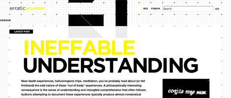
Erratic Wisdom
A Working Library
Elegant minimalism.

The Old State
Amazing classy typography.

Author’s Bio
Juul Coolen is a young, aspiring web designer slash developer. He is into clean and minimalistic design and thinks usability is important. You can find him as well at Shift (px).
151 Comments
Comments are closed.
Levi Levita
Good! =D
Greg
Really love this post! Keep ’em coming…
– Greg
WP Cult
I have implemented sFIR on one of my sites, works really nice. I would link to it, but it is still in testing, and should go live in a few weeks. :)
The Frosty
Cool Cool, Thanks for this one, I was un-aware of other typography tricks besides sFIR.. :D
i.am-ad.am
Good article! I can’t wait till we can stop using text replacement.
Although I love sIFR, it still has plenty of issues… which I doubt will ever be entirely solved. Just another reason to countdown till css3!
P.S. I’ve been wondering what you’ve been up to lately, WDW
Max
ive always wanted to implement sFIR on a website
cssProdigy
Great article, but you forgot about typeface.js. A JavaScript only image replacement technique.
http://typeface.neocracy.org/
couzinhub
You can also replace an title with an image without any span, by just using text-indent on the text, and by also turning the title into a block.
Optionnaly you can hide the overflow to avoid the weird outline when it’s a link and you click on it
h3 {

  display:block;

  width: 200px;

  height: 40px;

  background: url(header-replacement.gif) no-repeat;

  text-indent:-3000px;

  overflow:hidden;

}
couzinhub
Oups.. just noticed you actually talked about this one :)
Jonas
great summery of this topic. well done! =:)
Lieven
What is the PHP-thing? (Flir)
Anyone used it?
( I don’t get it by reading the explanation)
Shaka
Really good!
Jarryd
I’ve used all of the above minus the CSS3 option really because most of my clients have never even heard of Firefox or don’t use a Mac (Safari).
sIFR is good for Headers, but I had trouble using it for anything else.
FLIR I use when I need small blockquotes or spans to be different fonts.
Both are good, but sIFR is probably better due to it being selectable. Even though it is software dependant, there are compilers out there that can build the swf for you.
Si
text-indent method is still the best. The flash method is good for dynamic content.
Even with the @font-face method you dont own the rights to place the fonts online : (
Dave
http://openfontlibrary.fontly.org is a beta site for hosting free software fonts for use with @font-face :-)
David Hellmann
nice overview about the image replacement technics!
Juul Coolen
@Lieven:
Maybe I was indeed a bit too quick on that one. Basically what FLIR does is dynamically generating an image server-side using a font that also resides on the server and finally sending the result to the client. So you could say it’s a dynamic FIR.
Hope that helped.
rossella sferlazzo
Interesting!
http://www.sferlazzorossella.wordpress.com
printers brisbane
Great summary of this topic indeed!! thanks muchly!!
Ian Purton
I have a little tool for taking a truetype font and converting it into a Sifr swf file.
Here http://ianpurton.com/sifr
Ben Carlson
@Lieven I believe PHP generates an image with the font you specify and uses image replacement to stick it there. Just automatic image replacement.
Patareco
Nice text replacement solutions! All clearly presented!
Ahmad Esmaeilzadeh
Is there any solution for RTL languages like Arabic and Persian ?
ddsign
It’s nice the new solutions for fonts in CSS3. It’s fabulous that we could use any font. I hope that this was standard soon.
Hayalmeyal
beautiful text design.
http://www.hayalmeyal.org
ncus
Great summary in the image replacement method. Currently I am using the #1, this article gives me heads up to use another method.
arshad
that was very cool.thanks
Will doyle
Thanks..
..Quite intresting
; )
http://www.willdoyle.co.uk
Tangletail
hmm not bad
how do you submit a guest post?
Carlos Hermoso
I can’t wait for CSS3. It looks really good
Roxanne
Wonderful post. I very much enjoyed reading it! A lot of insight and help too. =)
joao
Cool, Thanks for this one.
my blog
korbsan
great Article! Love the illustration-graphics you put in your posts. Thank you!
cath
excellent article, very informative and easy to understand for a beginner! thank you
Vuongot
Thank you for posting this great article, my most favorite style of webdesign is typography, so it’s very helpful.
lolz :)
Patrick
You are forgetting typeface.js. typeface.js has the advantage of being javascript-only, no flash or images involved.
Chris
The Gilder/Levin is also problematic – if I understand how it works correctly, you can’t use transparent png’s or gif’s on top or else the the text below will be shown.
Is that the case or do I misunderstand how to do it?
Juul Coolen
@Chris
No, you’re correct. Unfortunately you can’t use transparent images with the Gilder/Levin method.
macias
nice article, very useful
Kayla
Very good post…very informative!
CMHB
Great article. I have used sIFR alot in the past, and it works really well. I have not used FLIR as of yet, but I might give it a go. Thanks for the info though. Very useful. Some great example sites too.
Green Sheep Design
Another great article – love this site!
Web design company
When using css especially with images and backgrounds, we also need to account for the vast population that now accesses the internet using mobile devices. Mobile nternet is one of the fastest growing areas and mobile browsers are still far behind standard IE or Firefox. There are a number of limitations especially when it comes to displaying images and CSS. It is important to also consider this in planning the design.
Alexandra Burke Bebo Skin
thanks for your informative guide once again, look forward to more of your updates
design bonn
thanks for this excellent article.
David Costales
Awesome, nice tut.
Will Doyle
Great Post
Thanks
Will
http://www.willdoyle.co.uk
werbeagentur bonn
thanks for this nice post .. very informative!
Branded07
In my opinion the best way to add specific bespoke and non web safe fonts to a site without any requirements from the user/browser/flash/or javascript is to use an image within a header tag. Eg.
The alt tag acts as the title when images are switched off and when style is switched off it still bids the site accessible as screen reader friendly. Great post still.
Branded07
The example below should have displayed as:
h1 – img src=”header-image.gif” alt=”header image” – /h1
Comments wont let me add html!
Juul Coolen
@Branded07
Thanks for suggesting that solution! I didn’t know that one up until now. It seems to be a valid option, but not a very widely used one I guess.
I’m not sure if the h1 tag is effectively applied to the alternative text of the image though …
Branded07
@Jull Coolen
This technique renders the site Semanticly valid aswell so it still picks up the header tags, it just uses the alt tag as the text rather than the image.
webdesign bonn
great post. thx
Blue Buffalo
Awesome article on fonts and the web. Great examples.
Dan
I really enjoyed the list of sites, great typography.
Juul Coolen
@all
Thanks for the positive replies! :)
Page Gardens
Wonderfully useful compilation! I’m currently looking into using sIFR.
Milos
Hi! I have good experiences with this css style for h1, h2 …:
h1 { width: 200px; height: 40px; background: url(‘image’) no-repeat; text-indent:-9000px; }
;-)
Rob
@milos: this is a good method and one I commonly used to use until I realised, a user with images switched off could not see the title at all. It is fine with CSS off but not images. Using a span is a better alternative.
joao
i loved the list of sites, , great typography.
my blog
Fumin
Just redesigned my blog, looking for suggestions.
Link
Nate
TYPEFACEJS at – http://typeface.neocracy.org – beats all that you list. But yes, it also has it’s downside, which is finding fonts that can be converted.
Check it out, you won’t be sorry.
Juul Coolen
@ Fumin
Not bad, perhaps spicing things up with any of the above techniques? ;)
Juul Coolen
Thanks, Nate. I’ll give it a look.
sadhu
i dun understand this tutorial >”<
João Henrique Ferreira da Mata
Excellent post!
Thanks!
visit my portifolio: http://www.swebstudio.com.br/jh
website design delhi
Hi!….
I was searching on internet and I found your web design blog…..it is really interesting…keep it up….look forward to read more from you
Find-A-Designer.co.uk
Nice article, as usual!
Find design work at Find-A-Designer!
Gav.
The Frosty
Nice Nice!
Alvaris Falcon
Again a great and comprehensive article for every designer, thanks!
Will Doyle
Thanks
very usefull
Will
http://www.willdoyle.co.uk
cutt
thanks!!!
Very usefull…
ralph
Thanks a lot for this great article about fonts on the web, very nice and clear. Thanks for share all this tricks, great help.
regards from
Ralph
http://www.deprowebs.com
Web design
It would be very useful to be able to maintain special fonts through CSS, but I didn’t heard of such a technique yet.
Carlito
How many different fonts can i use on the same page? Is there any limit at all?
here is used: http://www.exdizajn.com/blog/ is used two, or maybe more different fonts and it look nice
education in India
nice design
aurelio
kslaòskskalòkwq
Jauhari
Wonderful list ;)
zuhaini
Cool! by the way, can you please make a tutorial on how to do a layout / website design like this one..? thanks!
Di
This is great! I only wish I had the time to implement it into my site. I will however try to in my new sites.
Thanks for posting this.
promovare site
very interesting and useful article
Great work!
Happy New Year!
TJ @ Smartblogtips
Very informative article. Will give it a try.
–
Regards
Thinkjayant
cath
thanks, really clearly explained, a very helpful article.
Nate
Check out http://typeface.neocracy.org/ for a cool and easy way to put custom fonts on your site.
web 2.0 designer
Good informtaion about CSS3 and font-face rule…Thanks
Skracanie linków
@font-face is awesome tag, hope CSS3 will be more and more popular.
Alice
I was under the impression that setting content to display: none; means you run the risk of it getting picked up by Google who would think you were trying to “keyword stuff” your site. Which means you might get de-ranked for using black hat techniques. Does anyone have any more info on this?
dselva
Wonderful Article about CSS font rule!!!
thanks
dselva
http://www.dsignzmedia.com
Gelston
another great post!
Juanmanuel Lopez
hi! great info… i like to know how work then the web page dafont.com… thanks!
Graham
Thank you for showing all the various techniques and for explaining everything so well. It sure does help when you have the “know how.”
MJ
Another magic post :)!
You’re one of my fav teachers on the web, very useful and informative blogs
Carlos Hermoso
I just can’t wait to see CSS3 working out. It’s going to be awesome!
Sr. Ternasco
No negative text-indentation in substitution of hiding the text.
Text visible for human readers.
Text visible for any automated source readers.
Accessible
.foo { z-index: 1; position: relative;}
.foo a{ display: block; height: 12px; width: 12px;}
.foo a span{ position: relative; z-index: -1;}
I think this the perfect solution for a CSS/XHMTL technique
:)
MaximaDesign
I use a construction
<h3><em>my text</em></h3>
or
<h3><b>my text</b></h3>
or
<h3><u>my text</u></h3> …
Jon
I’m a tutor at a web design course in London (http://www.digitalartscollege.co.uk) and one of the main topics we cover is typography on the web.
Thanks for the great article – I will be asking all of my students to bookmark this post!
Ehab
Hello everybody ! When do you suppose CSS3 will be server to the mass ?
Petra
Thank you! A very helpful information about fonts and webdesign.
SEO
I love the font design…………great useful information
Jimmy
Hi,
Such a nice information.I learn many from this article.Good looking website
attracts the people.That is because of font.www.cyberdesignz.com is a informative site.
gaijun
Nice list, thanks!
Amrita
Great post. Well-done.
NDT Technology
css design very look feel good and as well as if you want website you cant without using the css
NDT Technical Paper Download
nice post and you are clearly explained the css
thanks
Fantasy Sports Betting
Very creative use of fonts and layout, very impressive!
Magnetic Methods Image Processing
Very creative use of fonts and layout, very impressive. thanks so much
Miss Blossom
I tried this and failed miserably, but I have another site I plan to use it on, wish me luck and I will post it when I have done it.
davetiye
thankss for the summary
Sofia Norton - SEO Professional
We have been using CSS for quite a while but this is the finest design I have ever come across. Any site is just not done without CSS. I recently launched a new site and used CSS2.0 really looks cool.
merdiven
thank great article , nice blog, thnx sharing
gaziantep evden eve taşımacılık
thanks you very good
gaziantep evden eve taşımacılık
thanks you
Keith D
Seems like a lot of hard work just to use real text that the engines can read.
Having to use server side PHP plus javascript… come on, there has to be better ways to make your site look good.
I’ve read so many of these techniques…. and read the drawbacks of each, Not for me.
Thanks for getting me thinking.
Keith D
francisa
nice
diyet
very nice designs
Joe
I just finished up a design for my site that I think I can live with. Though, I’m still struggling to get my text to look the way I want it. Are there any css examples I could look at or tutorials I could go through. Any feedback would be appreciated.
lisa
thank you so much, it is very useful for me.I am looking for a tutorial about solving the problem of fonts appearance for a long time. It has been solved now.
François Royer Mireault
Thanks a lot again, helpful as usual.
premier cosmetics
Thanks, very interesting information.
cennet
Thanks What’s the problem here? Google could bury the meager profit number from even the biggest media conglomerates.
cennetevi
these are awesome!
thanks for putting in the effort to get this list together
cennetevi
Thank =)=)=) you http://www.cennet.gen.tr
jatropha, jatropha seeds
good article thanks for info
jako
I would freaking love to do that with my picture gallery!
Thanks!
bagsin
I have seen a site just using compo and fonts
Cyrus
Great , Fonts and the Web
Great article. CSS saved web design
Cyrus
Visit http://www.psdtoxhtmlcoder.com
dead sea premier
very interesting article
dead sea premier
very helpful article
enjektör tabancası
thanks you
vincentdresses
喜欢你们的设计与技术,常来看看
ijjal
woaahaaa…..cool….
Brazil Business and Investments
Great post! I think the font made all the difference in a design project!
Web free fonts
Really a Good info.. TFS :)
Jeannie Shoen
Thank you for the really informative site
Andrew L
Many thanks.. I have been trying to solve some problem relating to layers and this post gave me the answers. Great sharing.. keep it coming! Your other posts is equally useful. I recommend all people to read.
Melvins
Useful tutorial as well. It makes me smile and very useful in future.
Los Angeles Web Design
Henry Peise
As iphone 4 white 3GS has something of non-update to the iPhone range, but there are finally decent alternatives in the smartphone market, with the HTC Desire and Samsung Galaxy S leading the Android fight right to Apple’s door.
Juno Mindoes
At 7 June, 2010, the latest iphone 4 generation was announced. It’s been a high time to get the iphone 4 white, or we may lost the fashion trend. Don’t we?
altın çilek
Great post! I think the font made all the difference in a design project!
Sumeet Jawalkar
Awesome one !! I Think the font is what makes it different from others. I loved it and will surely help me in future..
complex 41
Complex 41 saç bakım seti, tamamen bitkisel ve doğal içeriği nedeniyle güvenle kullanabileceğiniz bir üründür. complex 41İçeriğindeki bitki özlerine
(55 çeşit bitkinin özü vb.) aşırı hassasiyeti olan kişilerde saç derisinde bir miktarkızarıklık yapması doğaldır.
complex 41
And then he handed you the thirty-five 55
complex41
And then he handed you the thirty-five 45
Gaziantep Evden Eve
I think it is wonderful everything is very nice emegine health
gaziantep evden eve
bendece I love the websites you showed as well. I found this new article that touches on fonts and font face kits as well that could work well with
Jason Curby
Great read, thanks Juul. I especially like the examples, I’ll be looking over this this afternoon!
j_hatfield
Great Article, I love the websites you showed as well. I found this new article that touches on fonts and font face kits as well that could work well with yours:
http://www.back40design.com/news/m.blog/22/communicate-your-message-through-typography
Auto Repair News
I do love the manner in which you have presented this particular challenge plus it does indeed present us some fodder for consideration. Nevertheless, because of what I have personally seen, I just simply trust as the comments stack on that people today keep on issue and in no way embark on a soap box associated with some other news of the day. Still, thank you for this outstanding point and although I do not concur with this in totality, I respect the viewpoint.
bitkisel
Great Article, I love the websites you showed as well. I found this new article that touches on fonts and font face kits as well that could work well with yours:
bitkisel
Great read, thanks Juul. I especially like the examples, I’ll be looking over this this afternoon!
yates en Ibiza
I love the websites you showed as well. I found this new article that touches on fonts and font face kits as well that could work well with