Why Design Drives Trust: How Users Judge Your Website
Yes, users put a lot of weight on design, and they do it fast. Research on first impressions shows that people judge how a page looks within a fraction of a second, and that this judgment colours how credible, trustworthy and usable they think the site is. Design is not decoration on top of the content. For a visitor who has never heard of you, it is the first evidence they have.
This article explains what the research does and does not show, which parts of “design” actually move trust, and how to check your own site. It replaces a 2009 post built on a small reader poll, which ranked slow load times, weak copy and poor visual presentation as the reasons people leave. Those three factors still matter, but the evidence is much better now.
What the research says about first impressions
Three findings are worth knowing, and each comes with limits you should keep in mind.
- Judgments are near-instant. In a 2006 study from Carleton University, Lindgaard and colleagues showed people homepages and asked them to rate visual appeal. Ratings given after 50 milliseconds closely matched ratings given after longer viewing. People form a consistent opinion before they can read a word (Nature’s report).
- Simple and familiar wins. A 2012 study by Tuch and colleagues, discussed on the Google Research blog, tested screenshots of real sites. Pages with low visual complexity and high prototypicality, meaning they look like the sites people already know, were rated most appealing, and the effect of complexity appeared at exposures as short as 17 milliseconds.
- Looks drive credibility judgments. The Stanford Web Credibility Project, led by B.J. Fogg, asked 2,684 people to evaluate real sites. “Design look” was the most frequently mentioned factor, appearing in 46.1 percent of the comments. That is a share of comments, not a share of people, and it comes from a 2002 study, so treat it as a strong signal rather than a precise constant.
None of this says that a pretty site beats a useful one. The studies measure perception, and perception is the gate. If the first impression is poor, many visitors never reach the part where your usefulness shows.
Looking good and being usable are linked
People tend to assume that something attractive also works well. Designers sometimes call this the aesthetic-usability effect. It cuts both ways. A clean layout earns patience when something is slightly off, while a cluttered one makes every small friction feel like proof the business is careless.
The original 2009 poll made a point that still holds: design must support the content. A beautiful hero image above a vague headline is still a weak page. The best-performing designs combine three things.
- A clear point of focus on each screen.
- Familiar patterns for navigation, forms and checkout, so nobody has to learn your interface.
- Copy that says what you do, for whom, and what happens next.
Same content, different design
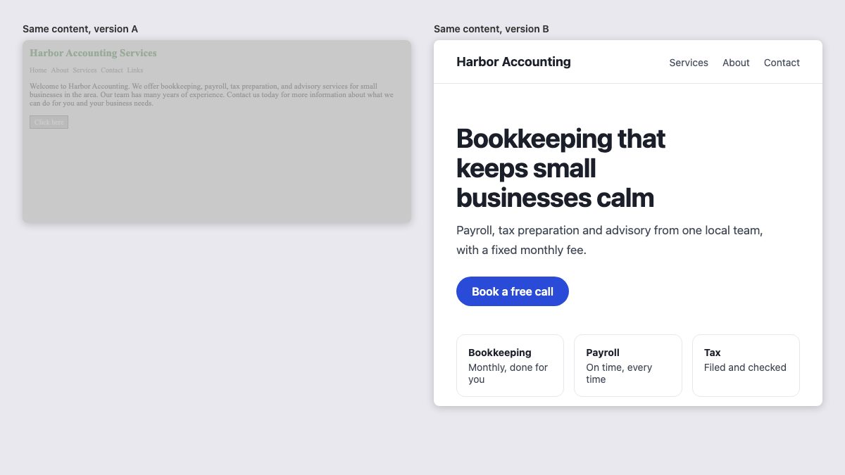
The comparison below uses identical information for an imaginary accounting firm. Version A has low-contrast grey text, a default serif, a vague “Click here” button and one dense paragraph. Version B has a clear headline, readable body text, a specific button label and three scannable points. Nothing about the firm differs.
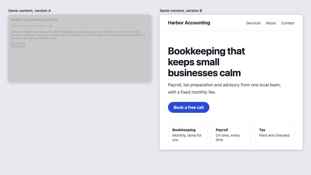
Which firm would you call first? Most people pick B in about the time it takes to glance at the screenshot, which is exactly what the research predicts.
The design factors that build trust
Stanford’s published guidelines for credible sites include “design the site to look professional, or appropriate for its purpose” next to “make the site easy to use and useful” and “avoid errors of all kinds, including typos and broken links”. In practice, that translates into a short checklist.
| Factor | What to do | Why it matters |
|---|---|---|
| Hierarchy | One clear headline, one primary action per screen | Low complexity is rated more appealing |
| Typography | Readable size, line length around 45 to 75 characters, restrained font choices | Text is most of the page; poor type looks amateur |
| Contrast | At least 4.5:1 for body text under WCAG | Readable for everyone, and it signals care |
| Familiar patterns | Logo top left, standard navigation, obvious buttons | Prototypical layouts feel safe |
| Real content | Real photos, named people, address, contact details | Shows an actual organization stands behind the site |
| Polish | No broken links, no typos, consistent spacing | Errors read as carelessness |
If typography is your weakest area, our guide to typographic contrast and flow covers hierarchy in more depth.
Speed is part of the design
The 2009 poll found that slow load times were the top reason people leave, and that remains true in spirit. Google now measures it through Core Web Vitals, and its documented “good” thresholds are Largest Contentful Paint of 2.5 seconds or less, Interaction to Next Paint of 200 milliseconds or less, and Cumulative Layout Shift of 0.1 or less, measured at the 75th percentile of page loads.
Layout shift is a design problem as much as an engineering one: a page that jumps while loading looks unreliable. Reserve space for images with width and height attributes and avoid late-loading banners above the content.
Speed also has measurable business value. A study commissioned by Google and carried out by 55 and Deloitte found that a 0.1 second improvement in mobile site speed was associated with an 8.4 percent increase in retail conversions. It is an older, vendor-commissioned study, so use it as direction rather than a promise. If your site is a WordPress one, start with our guide to speeding up a slow WordPress site.
Copy and design are one job
The 2009 article argued that weak web copy drives people away, and it still does. The button in Version A says “Click here”. The one in Version B says “Book a free call”. The second is better design and better writing, because it tells you what happens next. Write headlines, button labels and form hints at the same time as you lay out the page, not afterwards.
Apply it to the parts visitors judge hardest
Trust is won or lost in a handful of places. These examples show well-structured versions you can adapt.
- Contact pages. People look for proof that a real team will answer. A form beside an info panel, as in this Bootstrap contact form with info panel, puts address and phone number next to the form.
- Pricing. Clear tiers lower anxiety. See the pricing table with a monthly/yearly toggle.
- Short forms. Every extra field is friction; a simple contact form is often enough.
- Navigation. Keep it familiar, as in the navbar with search.
How to test your own first impression
- Run a five-second test. Show your homepage to five people who do not know your business for five seconds, then ask what the site offers and whether they would trust it. Free tools exist for this, or you can do it on a phone.
- Squint. Blur your eyes, or apply a blur filter to a screenshot. If the main headline and primary button do not stand out, the hierarchy is too flat.
- Check contrast. Use the browser’s DevTools contrast checker on body text, buttons and footer links.
- Measure field data. Look at your Core Web Vitals in Search Console or PageSpeed Insights, split by mobile and desktop.
- Audit trust signals. Is there a real address, named people, recent updates and working links?
Frequently asked questions
Does design matter more than content?
Neither wins alone. Design shapes the first impression and whether people stay; content decides whether they act. A good first impression buys your content a fair reading.
Is minimal design always better?
Not always, but the evidence favours low visual complexity combined with familiar structure. Minimal for its own sake can hide navigation and hurt usability.
How old is the research, and is it still valid?
The core studies are from 2002 to 2012, so tools and visual tastes have changed. The underlying human behaviour, fast visual judgment and the link between look and trust, has held up well enough that the guidelines still apply, though you should test on your own audience.
Good to hear this stuff as a profesional in the field. I keep telling people this, but not everybody is buying it :)
Yup. I agree. Nice to see stats.
In this economic downturn I have a lot of small businesses upgrading their outdated sites to better design, good copy and fast easy load in.
Thanks
I’ve been looking for a study like this to come out. Not a surprise at all. I use a ton of web apps online for both business/personal reasons, and I won’t touch an app that doesn’t look modern and fresh.
I’ll be using this as a reference for future clients! Thanks much!
I’ll also be mentioning the bit about websites being a better investment than print or TV ads.
YES! It’s been so obvious that a change is coming, but I notice more and more that people seem to be abandoning sites with ugly interfaces. This is so encouraging, thanks for sharing!
Very good to know. I think the copy is the weakest part of my site, but I’m definitely working on it…
318 users is hardly enough to consider the data useful, but it is nevertheless interesting to see results on this (which I haven’t before).
I think each of the 3 choices are a different step in a users choice to stay on a site. Slow speed is obviously the most important because if the site isn’t loading fast enough, the user won’t even be exposed to the design.
After the site has loaded, the use next makes a decision on the design quality. If the site looks too ‘geocities’ they leave.
Finally after loading the site & evaluating the designs trustworthiness the user starts consuming the content which would take the longest of the three to make a determination on.
And I don’t like a site has toooooooooooooo many ads.
Its good to be a unique and user friendly website.
“A total of 318 web users were asked what’s most likely to drive them away from a website. ”
I put zero stock in what people say draws them to or pushes them away from a website. The vast majority of users have no idea what impulses go through their head from moment to moment.
Interesting article and comments. I judge a site first and foremost on how it loads … it’s easy to see when a “weekend warrior” has done the site, and this is what grinds me the most. I sometimes feel like I have been infected when I see poorly designed and developed site. But that’s me … clients might love it :P
Just the 318? Enough for a trend, granted. But assuming that this is an accurate trend, it doesn’t hold up to actual retention data.
In a perfect world, good copy, good design, and good speed would be the goals for every website.
Interesting information, sometimes the copy part doesn’t considered as important. Me too I working on it.
I think this is 100% right, however 318 is not a good number for proper stats.
And of course there is the client I just put together a custom design for one of my clients, it took me over 2 weeks, and what happens they come back and ask to use a awful bought design template. Why who knows.
Well I think a good design should also include good usability. Because even a super fast website is useless when the users can’t find the right informations.
This is an amazingly well written article with interesting statistics and a lot of what I have been thinking confirmed. I will be using this for reference material for the near future.
Thanks!
As a part of your web marketing, it is strategic to have designs that will catch a web browser’s attention. The uniqueness, simplicity of navigation and content should be balanced. Your blog is first noticed by the way it looks. It usually turns off visitors to see so many distractions on your web page when they read your content.
thanks you.but how can make beauty website by using any script like wordpress. because i don’t have sense to make beauty website,can you help me,,,,
I thought ‘slow load times’ will be third, but not the problem #1,.. hmm… interesting.
Another good article, but what there really needs to be is balance between all parts of design, look & feel, user experiance & function….
Interesting that three times as many would leave because of design problems than because of content (and as others have pointed out this doesn’t specifically address usability or accessibility). I keep telling people that content is King but it would appear then that design is Emperor.
I consider that many times web designers and programmers used on their sites the following word: “SOLUTIONS”. I really hate that, because it’s like they want us to believe we have a problem and THEY have the solution. I work in design and many people thank me because I never use that word. “I’m available to the customer’s orders” is what I say and that’s what they want to hear!
I couldn’t find this poll on the web site referred to, but a web poll offers users certain answers to choose from, and I notice that as the figures add up to 100%, the three reasons mentioned have to be the only choices offered. With only three to choose from, the poll is not reliable. Also, as it was an online poll, then only those who visit that site can answer it! So the survey sample is very biased, possibly limited to web designers seeking copywriters. And web designers like nice visuals.
i had a reference to a recent survey (by HP I think, but unfortunately I can’t find it now) that covered several thousand people, not web designers, and it had about six or eight reasons offered (a more reliable survey in other words) and visual design was the reason given least often.
So basically don’t trust online polls on sites most likely to be visited by web designers (a bit like being daft enough to believe that the web stats for browser usage reported from a web design forum are representative of the general public’s browser usage)
Useful info.
Load time is a real turn off! Flash sites, which take forever to load always infuriate me… even though someone has taken weeks to produce the site… I just move on to the next site.
Good visuals can hold you spelbound, all you want to do is stare at a really good looking site. But if looks amateur with a few graphics strewn about…
And so to the copy… info with humour is what I like to read, or just great info, like this site.
Probably bears out what most of us think, but it’s nice to see it in figures.
This is really a nice article. I like to inform you that in a good web design is a good performance of a web marketing. Going on. Thanks for sharing this article.
@Dr John
Spot on. This is poor research methodology, pure and simple.
The consequent assumption (dressed up as a “conclusion” because that sounds more authoritative) that web audiences are becoming more sophisticated in their appreciation of nice visual design probably stands up to scrutiny. It’s not a massively contentious claim, but then neither is it a particularly useful one.
Interesting poll. Just proves how much design really means. I think poor design loses a lot of trust between the webmaster and visitor– which can obviously hurt sales, or whatever the purpose of the website is.
I find the worse element in bad websites, the fact that a bad designed website is not logical builded. When you design a website (visually and technically) always keep the end user in mind! This is so important. If you apply this rule, i tell you, alot of websites could be redesigned with a new webdesign….
This has real merit, which any web designer, developer, web copywriter or usability specialist can benefit from. It outlines areas of dissatisfaction among web users. I personally agree with the conclusion: “Internet professionals would better serve Internet users by collaborating and delivering simple, fast, useful and convenient websites.” Arguing that would advocate we disregard our peers and design, develop and write convoluted, time-consuming, useless and inconvenient websites. And we all hopefully recognize that the world wide web already has enough of those.
I’m noticing that more and more of my clients are very aesthetically involved. Gone are the days when every design I came up with wowed every client. I’ve noticed that they are more often more choosy about the design and have many suggestions of their own.
Each of the points in this article should be considered, whether you are a web designer, web copy writer, or business proprietor. Thanks for posting this!
This article’s points rock. I agree with Elizabeth in that designers, writers and programmers should take something away from this article and consistently practice good design. It’s actually encouraging that clients are becoming more aware of the value of good design as professionals might not have to compete with amateurs much longer. I’ve started noticing that myself. Sure you can get a hacker to put together a logo for $30, but to do it right, it takes much knowledge and time, and therefore costs much more. Some web design clients are starting to get that. The same goes for a website. Thanks for sharing this info on web content!
Need Opt in Email list and email sending service? then please click on my name
Many solid points made surrounding web content, and how everyone, including designers and writers, can contribute to friendlier and more useful websites. I think many of us get in ruts here and there and need to read articles like this to rethink how and why we do things.
I admit I’m guilty of not considering web copy to be important. I have never worked with a web copywriter, but figure its about time if I want to improve my portfolio and start getting bigger and better clients. I suppose I’ve had me head wrapped up in aesthetics too long. Thanks for the advice.
It’s a good reminder not to forget about or discredit all elements of a good website, including design, navigation, usability, copy writing, code and so on. Thanks
Thing is all these values are for people with normal browsing expereiences, what about people with screen readers…wonder what they put first :)
A very effective and quite simple way to optimize the website for easier marketing and publicity. Tags play an important role in optimizing your website to be easily searched by the internet search spiders. There has been lot of advancements in the search engine algorithms that needs you to be precise while creating title tags. This is one of those crucial aspects which are overlooked by many while designing a website for their business and other corporate purposes. In the latest advancements of the search engine spiders, search engine optimization has not left by mere re occurring your desired keywords, It is highly required that your website design and content should serve as an enticement to the web spiders. It’s of no use to have a site which doesn’t comply with the standards of search spiders. I got my medical website reconstructed from a web designer and marketing company named medicalwebexperts.com. They reconstruct every page making it compliant with search engine algorithms. After a few months of time, the impact was definitely distinctive in my income. I have got a steady increase in the patients, which was a direct result of reconstructing and (re)marketing my old obsolete site.
So right the say that surfers are becoming more fashionable about web design.
It took me a long time to figure this out :)
To me, if you have choices and most of us do, if two sites offer basically the same content/functionality I will visit the one that looks better.
It’s clear that there is a need to optimize the speed of sites. It’s not all about flash intros. Sites can load slow for many reasons. Too many image requests and background image requests, heavy javascript, or large transparent png files. Yslow is a tool we use to test the performance of a website. It works quite well. https://developer.yahoo.com/yslow/
Matthew Hunt , Great tip. I installed Ysllow and it works great, found some performance issues in my own web pages.
Thanks.
At our studio we put an emphasis on having great content, it’s important for SEO and for users, if your site looks great, but has poor grammar and spelling, visitors are going to bounce.
Great design can’t exist without good programming can’t exist without proper semantics can’t exist without great content can’t exist without not knowing who your visitors are…. it’s the big picture I guess…
Users place more weight on design, but which users? Web designing process is a medal with two faces.
Enterprises wants to hide as much valuable informations as possible, from their potential customers and competitors, and so they put great emphasis on big pictures, big flash movies with little content and with poor web design.
Opposite are customers who wants goods and services, presented with good web design and good copy on web site.
But enterprises gives money to web designers for creating web sites. We web designers know very well that useful web design means – arranging and optimizing all elements on web page.
But people aren’t robots, they have commercial organizations and business secrets which want to hide from competitors.
Thanks for great article, but we live on planet Earth not on Mars.
WDS, I might be lacking sleep, but what’s your point? This article makes perfectly valid points, regardless whether you’re a visitor, designer or business owner.
Hey I really liked this post.
Being designer I always try stressing on the fact that we aren’t designing stuff for us but for people. So that they get what they are looking for.
But even then not many people design keeping that in mind. Result of that being we have extremely beautiful designs that take loads of time to load.
I work on both a Mac and a PC. Reason being as a designer Mac is the ideal machine to work on..but then again majority of the people use a PC.
I am a freelancer so I try and see to it that my designs are simple CSS based fast loading and looks beautiful in both my Mac and PC.
I guess with simplicity and good usage of space and fonts any design can be made more visually appealing.
Thanks again for posting something like this! A breathe of fresh air.
Interesting stats and even more interesting perspectives and insights surrounding web design, web copy and websites in general. It’s a reminder that web designers need to value what others can contribute to the design process and product.
I like the “True Beauty Comes From Within” . Spot on.
Very insightful article! Good web designers need to pay heed to info such as this. It’ll make a better Web. :)
This is really good to know! Let’s all put as much weight on design as we can ok? :-)
Not to be the nagging nancy, but 258 participants hardly seems like a statistically significant number. Show me a poll of 100,000 web users and I’ll perk up and listen.
Interesting article with solid points on improving websites with all possible elements, going beyond design.
According to this study and the points made, web writers are as important to designers and developers. Makes perfect sense. I’m going to start paying more attention to the value web copywriters can bring to my sites. I’ll just need to get clients to dig deeper into their pockets. :)
These above points are the true essence to promote a successful online business.
Though the points are really basic but are the cornerstone of a successful business campaign.
Angela
I’m surprised that navigation isn’t mentioned….I always want to find the information I’m looking for as quickly as possible…
I think web writer and designer (and programmer) all have to have teamwork in mind from start of website project. Otherwise objectives do not get achieved. When we fight for our own territory or selfish objective, we develop faulty product for the business.
True but sadly hard to pitch this to clients who love to get to this conclusion after burning few $ on a poor design and ending up getting nothing over investment.
Great article, but I have to agree with Jackson on this. 258 participants isn’t even a drop in the bucket and not statistically valuable. Nonetheless, I’ll be referencing it to help my case with prospects – is that considered unethical?
“Today, however, most people want to get information and complete tasks in as little time and with as few clicks as possible, so they can get on with their busy lives.”
This is so true, I don’t know how many times I’ve gone to a site trying to find something specific and these walls of flash intros keep getting in the way! I hope more people will take into consideration what the consumer is looking for and design beautiful, yet efficient sites.
I also wanted to let you know, you guys were featured here: http://www.webdesigndev.com/inspiration/17-dazzling-hand-drawn-website-designs
I completely agree with the results of the poll, I have experienced with my own website, during the time my site was hosted by a free host i had few users who registered in my site, that host was really slow and it had many down times, but when I moved the site to a new host which has a better speed and 99.9% uptime now I have lots of registeration these days and they are becoming more and more each day, this is the main reason for turn-offs, my registered users increased even more as soon as I redesigned my website.
I like the fact that this article points out both designers and web copywriters need to pull weight, along with usability experts and programmers, to give the market highly effective and desired websites. Excellent reference and insight for any website designer or writer. Thanks.
Thanks What’s the problem here? Google could bury the meager profit number from even the biggest media conglomerates.
Thank =)=)=) you http://www.cennet.gen.tr webdesignerwall Thanks
Hmmm…so web copy is slipping to design? I think both are integral. Interesting and thought-provoking article!!
he he…web copy writers take note, web designers are the kings of the web! I jest. Actually the article makes it clear that everyone working on a web (designer, copywriter, programmer etc) all play a critical role. What’s that cheesy saying…there’s no “I” in team!? ;)
I got the chance to read this article recently. Very True, “Web design is not a one man show nowadays”… Well, that’s a “Professional Integration?!!” :).
I agree with this result. Design is the magic thing in B promotion.
Hmmm…so web copy is slipping to design?
I think the way a website looks still needs to be explained to businesses, they need to be educated on the benefits of a nice looking website. Especially those who already have a diy website which looks awful. They’re harder to ‘turn’ when they’ve become attached to their own handywork.
These are really interesting statistics, it just proves that aesthetics are so important when it comes to web design and relating to an audience.
Cool, and interesting poll collection…24% of people are driven away from poor visual effects is still a relatively large number. Thats 24% that your business could have benefited from a potential customer. 51% of people were driven away by slow loading time would seem the most obvious and is still an important aspect to fix as this is the killer for a poorly done website. Still, designing a page to the visitors satisfactory needs can be challenging. This is why it is important to keep up to date on modern web trends and design tweaks that bring appeal to a website. Afterall, the results from the poll show it all. The costumers know what they want; we are advised and just have to adjust ourselves to the sometimes picky but sophisticated breed of online users.
Yes, its completely free to to re design your current website.
This is genuine offer, to qualify for this contest you have to follow intructions described below:
To enter this contest, you have to do is fan low5studios on Facebook and submit your worst sites to our Facebook wall. Also one lucky twitter follower will have a custom twitter background designed for them. The contest begins now and ends October 5th. One entry will be chosen within one week of the contest ending. You may also nominate a site.
http://low5studios.com/blog/?p=39
Designing is very important for any website. Visitor will not stay on your website to read the content if the designing is not good. There are some standards which should be followed by the designer while designing a website.
Web Design LA
If I got a chance, i will prefer buying the iphone 4 white but not the iphone 4 Black. Who can tell me where is the white iphone 4 available? I would really want to take one.
All of the iPhones are pretty bad during poor lighting conditions – and that’s where the new white iPhone 4 flash comes in handy.
The post is really the best on this laudable topic.
None of these are mutually exclusive: design, copy, IA, usability etc. All departments need to be talking to each other on the same page for a successful site.
I totally buy your point of having good website design. I like this post. Design is the key for any website. Because of the fine design and fine resolution iPhones are sold in mass compared to other phones. At TimeSEO all expert Web Designer in London has more complex tasks to do. More than 90% of our clients are buying maximum time of our web designers compared to programmers. Hence, we can say everyone is more into design and looks now a days.
These are really stunning, there are even some sites that are new to me. All the colour schemes complex 41are definatly brave but I really think they work to make the sites eye catching and engaging.