Viget Labs, a web development firm based outside of Washington, have been in the industry since 1999. With a team of 30 people, Viget Labs sure has a lot to blog about. Instead of writing everything on one massive blog, they separate their blogs into four divisions: Advance, Inspire, Extend, and Engage. Each blog has unique topics and design theme that are nicely wrapped together. I like them so much that I featured all their blogs on Best Web Gallery. In this article, Viget Labs is going to share their internal design process of the blog series with us. Don’t miss the insider tips!
Nick: Could you tell us more about your company/team?
Viget: Viget Labs is a web firm based outside of Washington, DC. Since 1999, we’ve been building websites for start-ups (like Squidoo and Odeo) and offline businesses, doing work like UI, custom development, and online marketing. Viget’s evolved from a few people in a basement to a 30-person team with two offices (Falls Church, VA, and Durham, NC), and four major "labs": strategy, design, development, and marketing.
Nick: What are the purposes of the blog series, since there is a corporate blog already? Are they just for fun, or strictly for marketing purposes?
Viget: From the beginning, we’ve been very community-focused; our new office space was even built to handle local events like Barcamp and the DC Design Talks. The blogs are an extension of this thinking. We wanted our team to be able share their insights on specific topics with specific communities. The corporate blog was too general for heavy-duty stuff like Actionscript and analytics, so we split it up by lab. Now, the developers (for example) can blog about Rails plugins more fully knowing their audience is comprised mostly of other developers.
Nick: The blogs seem to have similar structure, but very unique design. Could you tell us about the concepts behind the series?
Viget: The project actually began with the idea that the marketing lab needed its own blog, but as the design team researched marketing-related sites, we started wondering if each lab could benefit from the same mentality. So, from there we tried to work with a loose metaphor on each blog and use style elements that might be more familiar to the unique audiences.
![]()
Advance (Strategy): Since "web strategy" is such broad and daunting category, we wanted the site to look like a coffee shop: a casual place where team members can sketch out high-level ideas and chat with the community.
![]()
Inspire (Design): The visuals were influenced by favorites we found in CSS galleries. We wanted something with substantial white space, non-"2.0" elements, and elegent type. We settled on the sunrise/hikers illustration to convey an air of discovery.
![]()
Extend (Development): We wanted to give the dev team something fun to set it apart, so the "under-the-surface" metaphor (mole and all) seemed like a good fit. We also built in custom styles for code blocks, and a syntax highlighter for laying out more complex code.
![]()
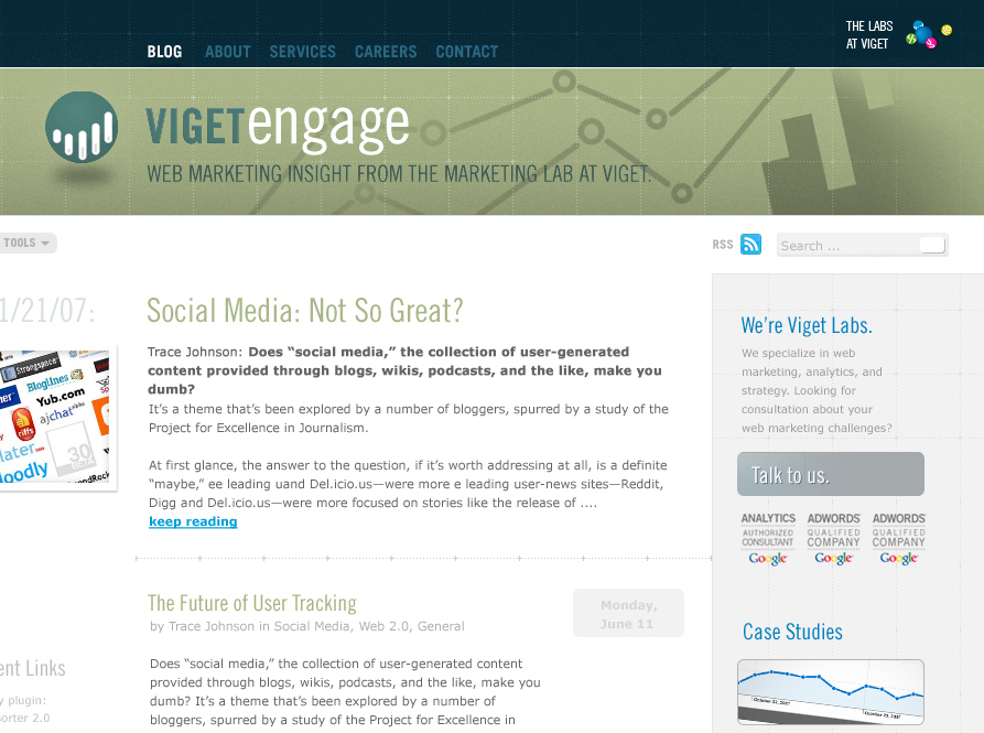
Engage (Marketing): The marketing team is all about solid, measurable results, so the design incorporates scientific elements with a shinier, modern edge. We also wanted to highlight the four aspects of web marketing (discovery, evaluation, action, and return) so we designed little icons for the footer, which they’ve now begun using in presentations.
Nick: What was the design process like?
 Moodboards
 Grid System
 Greybox
Viget: We began by creating moodboards and logo ideas for a standalone marketing blog. Once the project expanded to four blogs, we went back and wrote directions for all four looks to ensure they were visually distinct but considerate of our goals in engaging and facilitating lab-area-specific discussions.
The designs were built structurally at first, in black-and-white comps with 16-column grids. An early "Advance" comp with Napoleon in the header (don’t ask) was scrapped, but a lot of elements went on to support the Viget.com design.
Once we got to a certain point with the blogs, we continued making "verbal sketches," which meant writing stylistic tweaks and notes in text files instead of just playing around in Photoshop. This helped us get the most bang for our Photoshop time and contributed to lots of the best details (the team illustrations on Inspire, the single-pixels stripes on Engage, the mole on Extend). We’d spend a few minutes casually looking at the comps, compiling and deleting some notes, and then make the changes once we were happy with the direction.
For the main site (viget.com), the process was more like working with a client. We put a lot of energy into the wireframes, trying to give a mix of information about the the clients we’ve worked with, the work we’ve done, and the blogs we contribute to. We put together two comps over a couple of days, chose one, and worked on designing and layout out interior pages simultaneously. A project manager volunteered to handle the awesome photos, and our flash guy put SayViget.com together so we could link to it from the About Page.
 Early Advance: Early comp of the Advance nav, without author photos.
 Early Engage: A drearier version of Viget Engage, from the beginning phase.
 Early Extend: The Viget Extend design before verbal sketching (writing out style changes in a text file)
 Early Inspire: An alternate treatment of the Inspire header, somewhat inspired by ImaginaryFoundation. The designer preferred this version, but now realizes he was so, so wrong.
 Comp: Viget.com pre-polishing. The layout went unchanged, but the homepage went through several style iterations.
Comp Greybox: The greybox (see link) for the comp we didn’t go with. This comp emphasized the designs well, but buried the Services info a little.
Engage Moodboards: The verrrrrry beginning, three moodboards for a standalone Viget Engage site. After the far left one was selected, we went back to the drawing board to produce all four blogs.
 Engage Notes: A sample of the kind of style notes that moved the comps from these early versions to the final version at Viget.com.
Viget Extend Grid: The Extend blog as it spent most of its time; in B&W with the grid on.
Nick: What platform does the site use?
Viget: The whole thing’s built on ExpressionEngine, which made it a snap to reuse pieces from the blogs, combine feeds from blogs into team pages, and make the work sortable by category, without needing to grab developers for help (although they still helped us with the big stuff, like the massive import…we love you, dev lab!).
We’ll be posting more tips on how the EE setup over at www.viget.com/inspire in the next couple of weeks, so if designers just getting into EE have any questions, we’d love to hear from them and help out.
Nick: Finally, thanks to Viget Labs for their valuable time.
70 Comments
Comments are closed.
bweb
No way – a first comment ! ;)
Viget has very impressive portfolio, so it’s nice to get know a bit more about them.
Thanks!
M.Mahgoub
very nice designs, really impressive. creating those designs and writing blogs is a lot of work.
Henry Hoffman
Nice designs. I like how you’ve gone through the production processes – very cool.
Kings Design
Cheers Nick for giving us some insight in the design process of a Viget Labs.
A really interesting article.
Thanks
Alex
Excellent interview, I noticed all of the sites on BWG, nice to hear from behind the sites!
Ralph
Thank you for these great background information about design process of a Viget Labs.
Ralph
Ben
Nice interview and great sites.
Jared Goralnick
Thanks for sharing this insight–Viget’s redesign really rocks. It’s helpful to see the process that they went through, and it validates just how much forethought and energy is put into planning a site…and how that pays off.
Doug Avery
Here at Viget, we were thrilled to this article up this morning. You really laid out the elements well, I’m looking forward to reading more behind-the-scenes posts like this from other designers. Thanks for the great questions and help, Nick!
semil
Its nice and purely inspiration work for me… I smiled because I learnt so many new things everyday…
David Hellmann
i sea there pages on bestwebgallery > BOOKMARK ;)
looks good und interesting iview.
nice!
Brian Wynne Williams
Great write-up, Nick. Thanks for putting this together. Even though I went through the day-to-day process with the team, it’s really cool to see all the steps spelled out like this.
Jim
Nick, thanks for the write-up. It’s very exciting to actually be able to read about how everything came together.
JustChris
It’s nice to see how all their sites come together in the end. Viget’s work is very inspirational stuff and it looks like a very nice place to work
Franky
Insightful post. Especially interesting to see the extra polish added to the solid foundational work done. I like the idea of “verbal sketching” to lend focus to time spent refining design details. All too often, I just head back into photoshop and mess around, hoping something will stick. I like the intentional aspect of writing the ideas down, and for me it explains why Viget’s sites communicate so well.
Web Design UK
Great interview. Really inspiring to see how those top of their game do it, and gives us all something to aspire to. Many thanks.
momonov
more please!
Emma
Hey there, unrelated to your post, but your web design skills are uber awe-inspiring! I am a new grad from college at the start of my web design career and I think that your designs are definitely something for all young designers to aspire to. :)
Eric
this example of an agency with multiple blogs pertaining to different areas of their business is an interesting approach…as is with the text notes for design….something to think about.
kathy
Hi
I am contacting you through this contact form as there was no email address available.
I am mailing in to find out if there is a possibility of buying ad space on your website.
We would primarily be interested in buying a text link for our site seoedge.com from your homepage. Preferably intext.
If that is possible, please let us know an yearly rate.
Regards
Kathy
Web Design Harrogate
We’re looking into setting up our work using Expression Engine in the future. Looks like a pretty expansive system. I look forward to it.
Wade
Viget’s work is truly awesome, inspirational stuff. They produce classy, attractive stuff. Thanks Nick!
naran_ho
really enteresanate, nice work
Joefrey Mahusay
I like their blogs site. Fresh looking and unique with other design.
web design , almog
Great read thanks
Frosty Web Designs
Thats cool, was nice to visit the blogging site. I really think there design blog is amazing. Might help with some of my future work!
Frosty
Adam Kayce
Just wanted to let you know that I just found your site, and have been poring through every word and every pixel. Your design is awesome, the posts are quality, and this one about Viget just makes me geek out.
I’m the 10,592th subscriber.
Katalog Stron
Viget = great design. Truly inspirational.
Web Design Hobart
Great write up and a good company too.
retratos
Inspirational stuff no doubt, great company
Paintworkz Web Design
This is truly inspirational work. Their sites are too fresh and very unique. it is simple awesome
Patrick Algrim
I am wondering why the grid is off. If you look at the “grid on” the menu “blog” doesn’t fit into the grid. Also, the gutter is suppose to be your “padding.” So there really shouldn’t be any space once you start a column — see the entire right side of the “grid on” image. I think this is border-line mis-use of the of the grid system. How do others feel about that?
Community Sites
Useful tutorials for designers, who are working on community sites!
Strike
Thats cool, was nice to visit the blogging site. I really think there design blog is amazing. Might help with some of my future work!
Markup Factory
Ever since I met Rob from Viget at SXSW08, I’ve been an admirer of their work. Congrats on everything! Also, a very nice write up and interview.
sanjay
Welcome to Sanjayrout.com. The website is well known for its numerous invaluable work i.e. Website Design, SEO Analysis, Ecommerce Solution, Shipping Returns,Content Management Systems, Logo Design & 2d flash animation, what it provides its users/visitors. Through its various fortifying as well as par excellence services, Sanjayrout.com has been delighting its visitors that too with utmost zest. All the quintessential websites shown on Sanjayrout.com are a result of real life hardworking by Mr. Sanjay Rout.
For a long time, Mr. Sanjay Rout has been enriching their experience in the same field. Now, Mr. Sanjay has become an indubitable winner in the field and now, carving niche by touching new heights.
Additionally, Sanjayrout.com is aimed at providing most exhilarating Websites sharing experience at very economical prices. Sanjayrout.com incorporates humongous hi-tech enabled software that further enables the website to provide quintessential searching, Currency Converter etc
Bas Brand
Inspirational.
Let us know if this concept boosts blog visitors and business…
Min Thu
Great article, wish to see more like this, inspiring.
Ajay
Hello,
I want to start my own blog can u plz help me and tell after designing the layout wat else needed to start a blog site?
IT services india
Thanks NICK…!
It is great information about blog series, useful info for cummunity sites.
Html Conversion
Blogs classification is cool idea…!
Carlos Hermoso
I just love Viget Labs. Stunning design + high quality content
DavidDP
BEHIND THE JACKPOT; Divide And Conquer: Movie sweepstake Titans
sanat
thanks
dcreativemind
Hi,
I do follow r u site is cool man keep it up.
mIr dARBEz aLi
(e
__;)
(e
MDiogo
Viget creates some of the best blog interfaces around. They’re work is just great.
KooWii
thank you for sharing this with us. I’ve seen through their blogs and felt in love with them. Will turn to them straightaway for any help in the future.
cennet
Thanks Thanks What’s the problem here? Google could bury the meager profit number from even the biggest media conglomerates.
Bill Bartmann
Cool site, love the info.
Fashoo
I just love Viget Labs. Stunning design + high quality content
sandrar
Hi! I was surfing and found your blog post… nice! I love your blog. :) Cheers! Sandra. R.
angelina jolie
I love your site. :) Love design!!! I just came across your blog and wanted to say that I
bagsin
cool effect nice composition
Cyrus
Great , Viget Labs – The Blog Series
Great article. CSS saved web design
Cyrus
Visit http://www.psdtoxhtmlcoder.com
Mike
Hi! I was surfing and found your blog post… nice!
henrylow
Having been a part of the Online Universal Work Marketing team for 4 months now, I’m thankful for my fellow team members who have patiently shown me the ropes along the way and made me feel welcome
http://www.onlineuniversalwork.com
vincentdresses
The designs showed here show what simple and tasteful design is all about. Another one to consider
niliya
nice interview tips……..
websitereckon.com
check your website real value
nilika
great stuff…………..
WebsiteReckon.com outstanding web analytic tools on the internet today. You can use it for FREE. More than website value calculation, are target specific Traffic, pageviews. Fantastic!
nice site design ………..
websitereckon.com
Web Design
one word: amazing!!! thanks for sharing
Advice SMS
its really very nice and informative posting thanks for sharing this with us..
black celebs
Sign: wdpad Hello!!! nmrnw and 6899hgunnyuhss and 5142 : Sorry, what did you mean?? A??
cheap textbooks, user
i really appreciate the way you high light some of the most important facts and figure on Viget Labs – The Blog Seriescheap textbooks is also following 2.0 standards.. i have used all the standards which i knew may be it is lacking some thing… can anyone suggest me what should i do to improve it more..
thanks
Juno Mindoes
The white iphone 4 hardware design hasn’t changed from the one we already knew about. It uses the same materials as the prototype: Black glass and stainless steel rim.
Henry Peise
Moving on to a even worse conditions. I went inside a wardrobe and shot these photos from white iphone 4 during very poor lighting conditions.
altın çilek
one word: amazing!!! thanks for sharing
complex 41
These are really stunning, there are even some sites that are new to me. All the colour schemes complex 41are definatly brave but I really think they work to make the sites eye catching and engaging.
yemek tarifleri
one word: amazing!!! thanks for sharing
yates en Ibiza
The Blog Seriescheap textbooks is also following 2.0 standards.. i have used all the standards which i knew may be it is lacking some thing… can anyone suggest me what should i do to improve it more..
DymoLabels
hi
i really like this post
thanks for sharing