Web Design Trends With Live Examples
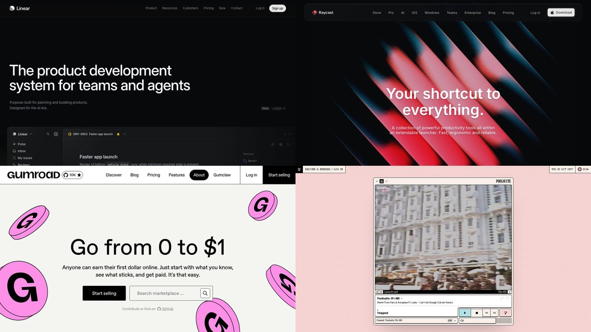
The defining web design trends today are expressive but restrained typography, bento-style tile layouts, themes that adapt to light and dark, playful or deliberately “unpolished” visual identities, and motion that respects the visitor’s settings. The glossy gradients and splatter-ink textures that dominated the original version of this article gave way long ago; what replaced them is quieter, faster and built on native CSS.
Below are the trends worth your attention, each with a real, live site that shows it and, where it helps, the CSS you need to try it yourself. Every site was loaded and captured for this article, and every browser-support claim comes from MDN or the web-platform-dx feature data.
1. Big, confident type, increasingly variable
Type is still the cheapest way to give a page personality. The 2008 version of this list celebrated script fonts and handwriting; today the energy has moved to large, tightly tracked sans-serifs and to variable fonts, where one file covers a whole range of weights and widths.

Linear shows the restrained end: one oversized headline, muted supporting text, and the product interface doing the visual work. For a variable-font playground, Variable Fonts lets you drag weight and width sliders on hundreds of typefaces before you commit to one.
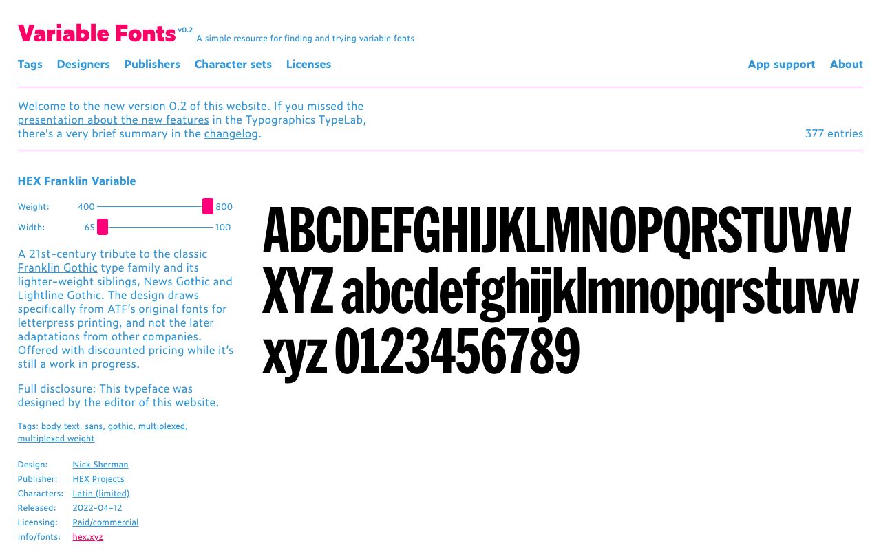
Two CSS properties make large headings behave: clamp() for fluid size, and text-wrap: balance to avoid a lonely last word. MDN lists balance as suited to short blocks such as headings and captions, and it has worked in all major browsers since Safari 17.5.
h1 {
  font-size: clamp(2rem, 6vw, 3.5rem);
  line-height: 1.05;
  letter-spacing: -0.03em;
  text-wrap: balance;
}
p { text-wrap: pretty; }
2. Bento grids and tile layouts
Instead of stacking full-width sections, many product pages now lay features out as a mosaic of cards of different sizes, much like a bento box. CSS Grid makes this trivial: span some tiles across columns or rows and let grid-auto-flow: dense fill gaps.
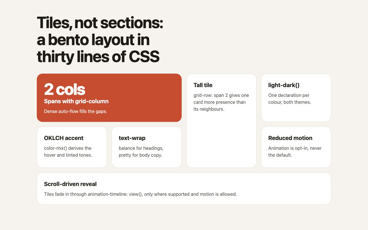
.bento {
  display: grid;
  gap: 1rem;
  grid-template-columns: repeat(4, 1fr);
  grid-auto-flow: dense;
}
.wide { grid-column: span 2; }
.tall { grid-row: span 2; }
.full { grid-column: 1 / -1; }

@media (max-width: 48rem) {
  .bento { grid-template-columns: repeat(2, 1fr); }
}
@media (max-width: 30rem) {
  .bento { grid-template-columns: 1fr; }
  .wide, .full { grid-column: auto; }
  .tall { grid-row: auto; }
}
The rule that keeps bento layouts good: collapse to one column on phones and keep source order meaningful, because dense flow can reorder tiles visually without changing the reading order for screen readers. For ready-made card patterns, see our product card grid and category image cards snippets.
3. Dark mode as a first-class theme
Dark themes are no longer a novelty. Both Linear and Raycast ship dark-toned marketing sites, and Raycast leans on soft gradients and grain for depth rather than glossy highlights.
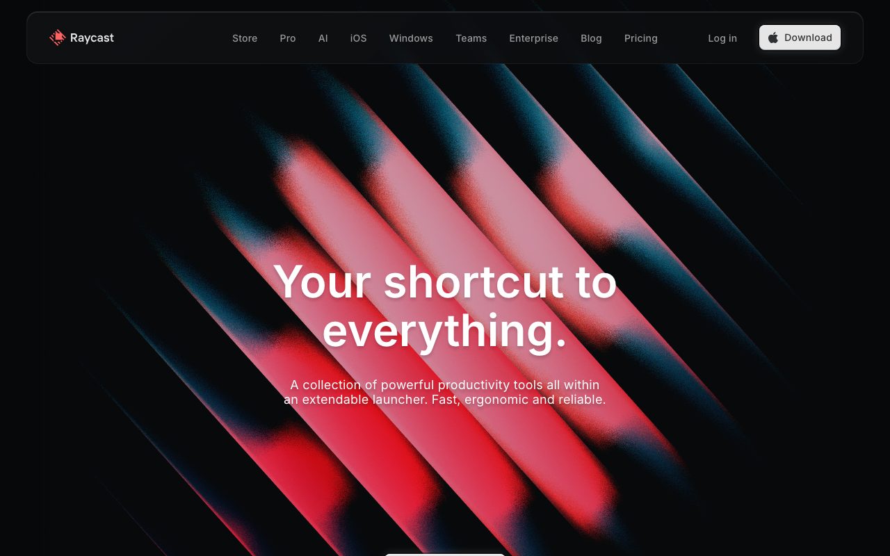
You can support both themes with one declaration per colour using light-dark(), paired with color-scheme. It has worked in all major browsers since Safari 17.5. Derive accents in OKLCH and tints with color-mix() so contrast stays predictable.
:root {
  color-scheme: light dark;
  --bg:   light-dark(#f6f3ee, #14130f);
  --card: light-dark(#fff, #201e18);
  --ink:  light-dark(#1d1b16, #f2eee6);
  --accent: oklch(0.68 0.19 35);
}
.hot { background: color-mix(in oklch, var(--accent) 85%, black); }
Always check contrast in both themes. The same accent that passes on white often fails on near-black. Our dark footer snippet is a compact reference for a dark surface done properly.
4. Neo-brutalist and playful identities
As templates and AI-generated layouts converge on the same clean look, brands are pushing the other way: hard outlines, flat saturated colour, chunky shapes and a sense of humour.
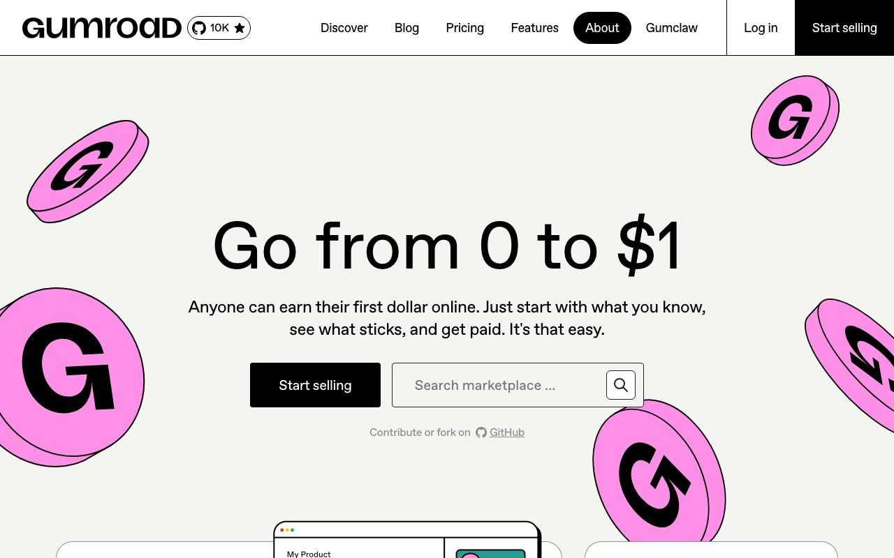
Gumroad pairs outlined buttons and cards with oversized illustrations; the page stays readable because the underlying grid and type are conventional. That is the trick with this trend: be loud in one layer (illustration, colour) and boring in the others (navigation, forms, reading text).
5. Retro and nostalgic interfaces
Vintage styling was a trend in 2008 and it came back, now in the form of operating-system nostalgia rather than paper textures. Poolsuite recreates an early desktop, with a player window, pixel-style icons in a dock and a menu-bar clock that shows a 1997 date.
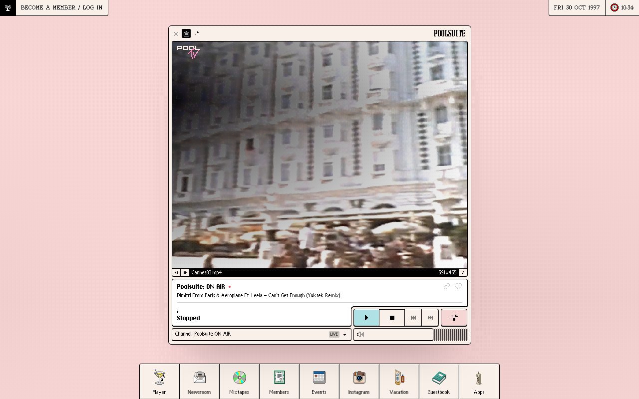
The lesson that carried over from the paper-texture era is that texture and a clear metaphor beat decoration for its own sake.
6. Plain, document-like pages
The opposite of all the above is also a trend: pages that look like documents. Are.na opens with a list and a short paragraph, in a single column with plain controls.
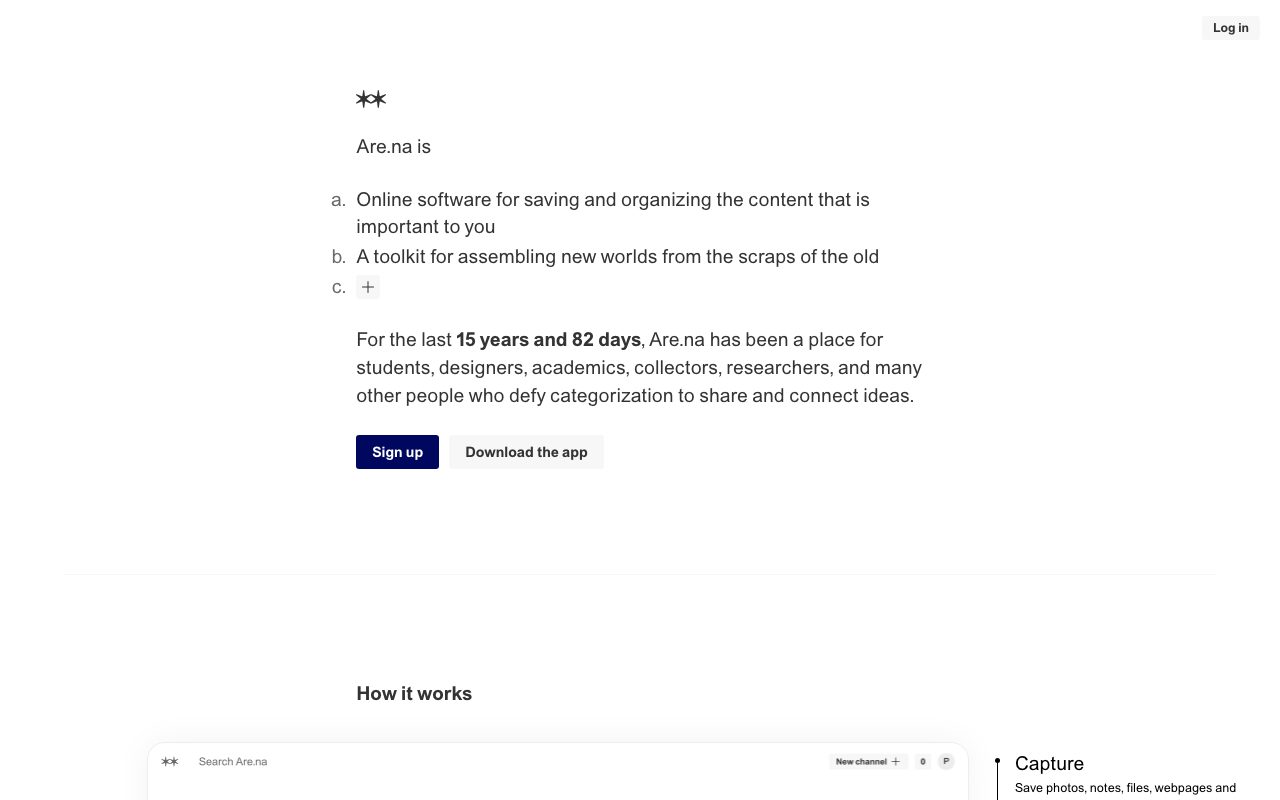
This style loads fast, reads well on any device and signals confidence. Plain pages also make accessibility easier to get right, because there is less to break: real headings, real links and default controls do most of the work, which is why the style works as a counterweight to heavy motion.
7. Motion driven by scroll, with a fallback
Scroll-triggered effects used to need JavaScript listeners. CSS animation-timeline: view() now ties an animation to an element’s position in the viewport. Support differs by browser: according to the web-platform-dx feature data, it ships in Chrome and Edge 115 and in Safari 26, while Firefox does not support it and the feature is therefore not Baseline. Treat it as progressive enhancement with @supports and respect reduced-motion settings:
@supports (animation-timeline: view()) {
  @media (prefers-reduced-motion: no-preference) {
    .tile {
      animation: rise linear both;
      animation-timeline: view();
      animation-range: entry 0% entry 60%;
    }
    @keyframes rise {
      from { opacity: 0; translate: 0 1.5rem; }
      to   { opacity: 1; translate: 0 0; }
    }
  }
}
For page-to-page transitions, same-document view transitions are in better shape: Firefox 144 completed support in all major browsers (see the section below). Both are covered in our collection of interactive websites built with CSS and JavaScript.
8. Component-level responsiveness with container queries
Bento tiles and cards now adapt to the space they sit in, not to the viewport. With a size container, the same card can be compact in a sidebar and spacious in a main column, with no extra classes. Container queries are supported in all major browsers, so you can use them without a fallback in most projects.
.tile-wrap { container-type: inline-size; }

.tile { display: grid; gap: .75rem; }
.tile h2 { font-size: clamp(1.1rem, 4cqi, 1.75rem); }

@container (width > 28rem) {
  .tile { grid-template-columns: 8rem 1fr; align-items: center; }
}
Put container-type: inline-size on a wrapper, not on the element you restyle, because a container cannot query itself. The cqi unit is 1% of the container’s inline size, so type scales with the tile rather than the screen.
9. View transitions for state changes
The View Transitions API animates between two DOM states with a cross-fade by default, and you can customise it in CSS. It has been available in all major browsers since Firefox 144. The same-document version is a few lines of JavaScript, with a fallback that simply updates the page:
function swap(update) {
  if (!document.startViewTransition) return update();
  document.startViewTransition(update);
}

swap(() => { panel.innerHTML = nextContent; });
.card-hero { view-transition-name: hero; }
@media (prefers-reduced-motion: reduce) {
::view-transition-group(*),
::view-transition-old(*),
::view-transition-new(*) { animation: none; }
}Give a shared element the same view-transition-name before and after the change and the browser morphs it between positions. Names must be unique on the page at any moment.
10. Human-made imagery in an AI-saturated web
As generated stock imagery becomes easy to spot, sites increasingly lean on things that are clearly made by someone: real product screenshots, hand-drawn illustration, photography of actual people and places, and visible craft. Gumroad’s illustration and Are.na’s plain list both read as authored rather than assembled.
In practice, this means three habits. Show the real interface or product instead of an abstract render. Commission or draw a small set of illustrations and reuse them consistently. Write specific alt text and captions that say what is in the image, which also helps visitors using assistive technology.
Trends that faded
| 2008 trend | What replaced it |
|---|---|
| Glossy gradients and reflections | Flat colour, soft grain, OKLCH gradients |
| Grungy and splatter backgrounds | Illustration inside clean layouts |
| Script fonts as decoration | Variable fonts and big sans-serif headlines |
| Image-sliced layouts | CSS Grid and container-aware components |
| Flash and jQuery effects | CSS animations, scroll timelines, view transitions |
How to use these trends
- Pick one expressive layer (type, colour or illustration) and keep the rest plain.
- Build the layout with Grid and fluid type before adding effects.
- Support light and dark with
light-dark()and test contrast in both. - Gate every animation behind
prefers-reduced-motion. - Check each feature’s Baseline status before depending on it; use
@supportsfor the rest.
Trends change, but these habits do not: readable type, a clear grid, and effects that degrade gracefully.
Awsome list you got here. Title should be “Web” Design Trends. ;)
Good deal. I still like some of the glossy stuff that’s out there, but I agree it is becoming dated. Ok – not ‘becoming’ dated – it is dated! ;) I like the current trends a lot though. Some sites here I have not come across… I love komodomedia.com. I also really like what people are doing lately with the handwritten notes in their styles. Thanks – Eric
Once again Nick, really great article rounding up those great designs.
Keep up the good work, it’s very inspirational.
Greetings,
Marco
Oh my! I am loving your selections… Thanks so much for taking the work xD I’ll add them all to bookmarks :D It’s so great for inspiration!
Nice compilation… but this is like saying there are trends in newspaper design…? I think trends are just that… trends… If you want to go with the flow, you take it… If you want to stand out… take ONLY what you need ;)
My site is going to use basic gradients and really subtle stripes (not Web-2.0 stripes, thank God).
And I do like the hand-written look that 2008 is sporting, but I’m such a noob with Photoshop AND I don’t have Illustrator so I can’t really do that much creative stuff just now…
Oh, another thing, the only glossy UI I like is the iPhone interface. They made the gloss look good there.
Has anybody else noticed space/galaxy themes popping up everywhere lately?
I’ve noticed that with a lot of the sites I’ve been doing lately, the project managers and art directors seem to lean towards the grungy look. Especially weathered paper edges and wrinkles etc.
Something I’d like to do is a web site with a bomber jacket leather look… fun!
This is great. It got me inspired to try and combine a few of these styles, like large fonts and grunge or similar. Yes I’ve seen the galaxy look on quite a few sites too!
And to think I just redesigned my “wood pattern” website. Anyways the sites you show are great looking and look as if they were designed more by a graphic designer than a web designer.
I am liking this trend… a lot better than the magazine trend that hit a while ago.
Really interesting, thaks for your compilation. Glossy style is slowly getting boring, I agree… But in operative systems it’s still “in”. At last in Windows… and Linux. Maybe the web is going some steps ahead, like in much more other things.
Hmmm… according to your words… this blog is really “in”!
I knew sketches and big font would be popular one day!
Great stuff.
Nick, excellent post. Is there any font out there that genuinly looks hand written. For example your pencil sketch look you use for WDW – is that a font or just drawn in PS?
Thanks
The “lineless” vector art (with or without gradients) is a big thing too, like the darkmotion site.
I follow always Best Web Gallery … beautiful css gallery, but I had never catalogued so well these sites!
Great beautiful work Nick!
such a great collection of websites, it seems that web is now totally evolve, wondering the last layout which totally change by now….
We tried to achieve the retro look with our site at discountcanvasart.com – I hope we didn’t fail too bad :)
Interesting selection of sites. Keep up the great work!
This is not web design, this is graphic design. For example what is described as “retro” is paper-retro, what is described as “collage” imitates paper collages. These styles are imports from outside of the medium they work with. Where is the authentic web design? This collection is just pretty Adobe-Creative-Suite stuff.
Ridiculous post. These are clearly not design trends in 2008 but visual standards that are always being used.
If you show enough things you will run into a trend. All of these trends have been around waaaaaay before 2008. I thought this was going to be relative.
Gorgeous site selection, but there’s something I don’t really understand..
These kind of trends don’t really apply if you’re working with customers. A style has to fit the customer, not the other way around. lots of the customers I work with won’t benefit at all from a retro style. That would only look ridiculous.
Alrite, this is a list of all design types around. Where is the bloody trend?
There is a lot of good sites, and all of them is gem in web pages. (just as this web :))
It’s an honor to be in this list!
Your blog really rocks!!!
The trend as I see it:
The pictures show websites with grungy textures, bent paper overlaid 3-dimensionally over a wooden surface. Pencils and rulers towering over text. It’s as if websites are trying to stop being websites. They want the viewer to see the site as a small slice of a virtual reality that resembles the real world.
Boring text websites are turned into a familiar setting: some papers on a desk, a portfolio with a pinclip and a receipt, a lab with a ruler and some charcoal pencil scribblings.
The old “block and text” format doesn’t cut it anymore. People want to see crisp reminders of the real world. The internet shouldn’t celebrate its inherent digital code with bland minimalistic geometric patterns that reflect the bland mathematical logic of its coding; rather, consumers demand the internet to manifest into something more organic—even if it’s just an illusion crafted by talented web-designers with realistic grunge brushes, paper textures, and ingenuity.
Web developers are picking up on the consumerist demand, and, by doing so, they are picking up on a new design revolution on the internet that reflects the human need to humanize (organicize) its externalized products.
I want to do something similar w/ my comments section – how’d you do it?
Yuck… I can’t wait for next year’s trends if these are this years. Honestly, it looks like everything they’ve been selling at Hollister, American Eagle, and Pacific Sunwear for the past year or two. Mind you, I skipped over and did not purchase those t-shirts either.
There is one cool web resource to search for web site design elements in 3D: 3DSN.com. Here is a sample search for, say, Canon SLR camera:
https://www.3dsn.com/
Unlike photobank stock photography these 3D renders are royalty-free. Over million of high quality photorealistic 3D items. Highly recommended
yah, especially with wooden pattern, I see about 3 different sites a day with black wooden patterns
Is this true that this year is not a glossy trend-like any more? Well, i kinda agree though, its so boring when a website use a lot of glossy things in everywhere.
But i wonder, when is the trend for metal, robotic kinda thing?
Thats a bunch! I think I have some of those ideas in my site, didn’t know I was even so trendy, ha!
Good and bad styles of web design don’t exist, only good and bad web designs. I think a lot of bad design happens when too many elements are used too much and the message is lost. Grungy, glossy, and gradient web designs can all fail if they don’t communicate.
Very good collection.
The only one thing that you forgot is the glossy look that started to appear more often, after Opera 9.5 beta was released.
Aren’t these all trends that have been going on for the past eight years?
Seriously.
I agree with Cute Indira!
The glossy look is quite popular
Nice Collection! yep like others said how about Glossy? Anyway, I like grungy collection.
Great trends but sad to say that i’m huge fan of glossy. I think thats your idea of design eventually the whole world wide web. You are most influential web designer and pro blogger right. Keep up the good post and keep it rockin. Godbless!
I’m actually going to have to agree with Oliver. Anyone who is on their game about design knows that this collection has been the trend for a while. This blog needs to be renamed as “Design Trends for the 2000’s.” I do “dig” the insanely large fonts in the big font section though.
Very very nice article. i love all this please do more updates ;-)
Awesome collection! – Although, to be honest, they’re all very similiar. – Don’t get me wrong, I really like most of them, but this isn’t exactly “breaking news”
I wonder what next year’s trends will be…
The novelty is that most of them are blogs.
We’ll perhaps create twitter’s templates, a day…
please, with any software or site, you take this screen shot ?
thanks
I’m also a huge fan of glossy style. You can see it on my blog’s design.
bad or good design doesn´t exist. it´s just seem to be a matter of suitability…well sometimes of taste but this does not really count. ; ) design is a complex process of analyzing my clients demands, pushing forward his ideas, and finally accomplishing his business goals by primarily creating something useful. nice compilation anyway…
Is it just me, or do all the websites under Zig-zag category use the same zig-zag pattern? Or at least the first 3.
Great! Where is my web design blog? imaginepaolo :)
These are not really *new* web trends. They’re just existing graphic styles apllied to the web…nothing really new here. I wouldn’t go with most of the styles here, since they’re already overused.
They aren’t – new – and I think we should not go with them :) But they are ‘trendy’. To be true, I’m tired of most of them – because similar are everywhere!
But the compilation is very good :)
Well, now we know what the problems with designs are, lets not do it anymore shall we?
Its good to know whats in 2008?
But do u think web 2.0 is out of the window or is it temporarily out of the scene?
I dont follow web 2.0 style. But just curious to know.
I think Retro & Collage designs looks good. No complains.
I like your design too… its too floral. I think its beautiful represents nature, free, independant and fresh.
Grunge is definitely not my style! Although I like the idea of incorporating big font typo and script fonts too. Script fonts look good and easily attract your attention.
I am so happy to hear that other designers dislike the over-use of reflections and gloss. This list is so very refreshing, but mostly I appreciate the proclamation that gloss is dead. I can live again.
These are also 2007 designs. I thought about doing a similar blog on the same exact patterns. You forgot to include the Vine-like designed ones, but everything here will get overdone.
Now the question is; What’s Next? :)
These designs are really interesting. Trends are great to acknowledge because now we know what to change to stick out in the future! We want to surprise and capture the eye don’t we?
“New style” is about “customer’s wants”..contest is very important. Vintage or futuristic is relative
As long as Apple is using reflections and glossy gradients on their site, that style will not be dead. There are an unbelievable amount of designers that still look to Apple for design guidance and trends. I agree that the site trends of 2008 are more appealing and creative, but I think it is a stretch to say the 2.0 style is dead, or will be dead any time soon.
Wow! I wanna be a designer like them! (or you) ;)
enough with the goddamn paperclips. nobody even uses them in real life.
WOW! Such a great list of websites, this will come in very handy for some inspiration when i get stuck. This website seems like a combination of a few of the categories that you listed in this article. Combinations always seem to work best if you can pull it off like this. Excellent list, and wonderful website layout you guys have here! Thanks stumbleupon.
Good post and you’re right about the glossy style being overused, every site appeared to be glossy for a while. It seems more wide ranging these techniques, with not one dominant style which is good
Yeah.. really cool works
Seems i need to update my web style :(
But thanks anyway..you’re the best
I love the vintage style, works so well.
Thanks for adding my site Nick. Keep up the good work.
It’s nice to see that Web 2.0 didn’t quite make it all the way :P
I think these sites are beautiful in their conception but the usability is not too good on most of these nice designs. People surf the web to find information and too much flashy design or too much background make websites harder to read and harder to find relevant info- which makes your lovely website less effective in communicating your offer or message.
LA dude, are you saying that these designs are mostly useless? What would make them more “usable”? Larger navigation maybe?
I can confidently predict that the ‘Grunge’ style of websites will soon become as tedious as the ‘Web 2.0’ trend.
How does a grunge style site support the brand? Lazy designers can’t be bothered to think about this (and probably a hundred other reasons). Its also incredibly easy to make it look good, because of the destructive and random nature of it.
Personally i hate it. – That and paperclips in web designs.
well as I see, the design of this blog is simply amazing, and the others you have mentioned have similar concept, I believe you might have designed a few of those awesome websites. thanks for the list as it gives inspiration.
To those who make ridiculous statements like the posted examples are not web design and simply graphic designs, you are idiots. Graphic Design is not a field. Graphic Design is a term and a basic foundation for print, web, video, outdoor, etc. The world is a better off place for talented graphic designers who can make a web site look better than a print ad. Get off your snobbish stools and start designing. Those who complain about the amazing designs pictured here probably can’t design half this good anyway. My hats off to all the talented designers who continue to inspire and push the limits of web design to bring us into new levels of realism and everyday objects. I love everything I see here. GREAT post. I am inspired.
A great list – thanks. I agree with a few of the posts, however, about these sites being over designed, over complicated and not entirely usable. The use of the transparent PNG has freed up a lot of the limitations we previously had and maybe some folks are going overboard. Get it out your system – less is still more. A few companies have lost my online business recently as I can be bothered learning how to use their site. Dont get me wrong – these sites look great – just not entirely usable…..
All these examples you have posted as Design Trends all look the same. It’s just the same photoshop tricks copied form Computer Arts magazine (or whatever) trotted out again and again. There doesn’t seem to be anything new going on here in terms of technique. I’d like to see a trend where photoshop monkeys with no real grounding (or interest) in the amazing thing graphic design can do are corralled off into some secret place where they can admire each others use of drop shadows and filter effect out of sight of the rest of us internet users… oh wait it’s happening already…
You’re missing “large Helvetica.” This certainly seems to have become a trend in the last 6 months.
I love the naysayers… they talk smack, but their sites look and feel like third-rate rubbish. Lolz.
Personally, what I find amusing is that I have, literally, every single one of these sites bookmarked on my “Good Designs” folder.
*High-five’s Nick’s taste*
Wait for our redesign / rebrand, we’ll blow you all out of the water. ;)
Its a gr8 Site to visit in…
I really liked it..!
Hello friends,
M a web designer…!!! ([email protected])
Will like to work with u… if any projects
how many paperclips can you get in there? :)
Great designs! How does someone go about getting some knowledge on how to design sites like that; so that we can keep our designs up-to-date?
Great collection of truly artistic web design.
I hope that these designs of artistic expression will bring the whole web 2.0 style to a new level… This is why I have been such a big fan of Web Designer Wall, for breaking out of those barriers.
Wow some great work here! Have you seen this site:
http://www.graylabel.co.uk
I love the background idea!!
Does anyone know a tutorial on that pencil sketch style?
Thanks. @Nick: you are awesome!!!
Nice collection.
Glossy web buttons… yuk yuk YUK!!!
Delicious Bookmarks 2.0.64 (FireFox extension) has glossy buttons. They used to have nice flat matt buttons that looked good. In their update for FF3 they introduced horrible bubble crystal glossy buttons.
What were they thinking???
Delicious is supposed to be cutting edge social web technology.
I posted a comment about it:
I referred to this article of yours so I am just making a reciprocal comment here.
Really interesting. Gave me a lot of ideas for upcoming projects even if I knew most of these sites.
Latest trend is all about pure CSS web 2 layouts with more vibrant colors.
Very interesting stuff. I particularly like the handwritten notes style and it’s being used widely these days.
A comment couldn’t describe how unbelievably awe-struck I am by this site.
I thank you for it. =D
I agree with all of those trends, and for the most part enjoy them, but… I think that Splatter Brushes are out of style… For me it seems like Splatter Brushes were 2006-2007. I am not a big fan of that trend, and I hope it continues to fade out!
I have always been a fan of retro style and I am glad to see the trend continue.
:)
This is a great post. I’ve grown tired of the glossy 2.0 look and this has inspired me, I’ve come up with some great new ideas because of this. Thanks so much.
Very nice information , i find it very valuable .Splatter ink & Sketches and Handwritten Fonts = emo style :) Cheers, TEmelie
great article…
i’ve used the handwritten notes style on my own site but i have to admit that i really like all of the retro style websites. perhaps i’ll try to incorporate some in the near future.
Love the intricacies and details that designs are going towards.
We ourselves are just about to release a site that’s a bit more graphically detailed than we originally conceptualized:
From the looks of things, designers and developers still have the creative urge to push the envelope further and further with web design.
Awesome collection!!!!
Where are my designs???:
Creactiva, the city
Amuki
Very interesting stuff. I am new to website design but after seeing those examples I want to get into it fulltime. Thnxx for the motivation.
Lovely stuff. Nice to see that web design is becoming an art with taste. It’s like looking at great print magazines, but on the web. Nice efforts in putting this lot together.
greate collection. thankyou very much for that. But, I could’t decide that looking to those site is good or bad for me!!! ;) really frickin good!
Its seems as though Web Designer wall took these amazing trends on board ages before they have swung into fashion. What an amazing era of design we are in! :)
Visit us at http://www.skytemedia.com
I hugely appreciate your keeping readers abreast of design trends, but how about design fads that have gone out of style? Things to avoid, perhaps, or trends that have been overused?
Wow really inspiring – I like your trends analysis – Would you think that this site falls within the new scope of trends:
http://www.graylabel.co.uk
Web Design Kingston
Well ! dude its hard to point out and say about design trends.
I feel design is kind of culture and its always changing.These designs are usually seen in most websites but I dont find any uniques in such websites..except grunge concept…………………..Lastly, by saying bout design trend of 2008..it sounds like we are creating awareness among Designers to follow such concept may be pshychologically….
How long will the above designs stay in trend? Where will design trends go next? Who’s going to be the first to influence this?
I’d be interested on your thoughts! Contact me:
http://www.skytemedia.com
Great work, love this post it is full of new ideas.
great collection! Thank you!
to cali:
Thanks for sharing the link to https://www.3dsn.com/
That’s what I was looking for for a long time. I located the right 3D model of iPhone very easily. I needed one for my animated banner ad project so the camera angle and smooth-n-soft iPod’s body reflections were critical. The one which I found has neutral environment reflection and real polished metal&glass look. Virtual camera lens were chosen perfectly (similar to my Canon 50mm EF); composition in 3/4 is fantastic!
It took me much less time to do post production in Adobe Photoshop
I think the surf style will be more and more popular with some time now. The surf style i think also make the sites alot more personale. When you make a surf site you have more “free space” It isent so mutch thinks you need to follow also :)
Surf style Rock!
I’ve been working on a design that fits in this category of style for the last 4 years. I keep simplifying my design. I’m finally happy with what I have minus a few page headers going up this week. I never would have thought that this style was going to be popular like this.
excellente site, i loved all the links and all the images, i come from Guatemala and my passion is the graphic design, my blog is ultimategraphicdesign.blogspot.com
I dont really like this. I think most of the categories could be lumped into one. For example the use of actual object/handmade objects. This covers handwritten fonts/notes, splatters, collage and grunge.
These trends have been here for almost 3 years, can you really not see more deeply into this years design themes?
Maybe the design world is experiencing what the UK design market was 3-4 years ago. No new ideas, and a lack of diversity within the market. Obviously someone needs to shake it up a bit. Cause these trends are getting as old as vector graphics.
espectacular, un abrazo
gracias
Nestor Arias
Bogota Colombia
Great post and a great collection of sites – as ever, you’re an inspiration – thank you. I was interested by Jewsus’s comment though – because I’d also love to see the trends s/he has in mind.
Don’t bring vector art into this. Design wouldn’t be where it is today if it weren’t for vector. All these sites are great and accomplish what they’re intended to. I’d like to see where the UK design market is heading, because we all know that brits are on top of things when it comes to new and fresh thinking. Like seeing a dentist or playing football.
It is nice to see the internet finally moving over from the Web 2.0 (or high glossy style look), lets hope that more of clients start to take notice to these new trends. So far in 2008 we have only had a few clients who wanted to shift with these new design trends, however I have a feeling that it will catch on even more.
@ec Thanks so much for the kind words about our site. Everyone wants to redesign it already but comments like these make me want to keep it a bit longer.
Tony – OnWired
Looking at a lot of these website thumbnails puts me to shame. I think I need to learn more graphical techniques and layouts rather than concentrating all my efforts into getting the code to validate!
It’s certainly food for thought…
thanks for compiling these. it seems like the overall web design trend is shifting from the glossy “web 2.0” look to a more freestyle, print appearance, with a rugged feel. I think the next web design trend should be Surrealism. melting pages that aren’t pages at all but crazy “virtual acid trip web apps”??!!? web 2.ohhhhh!
Excellent. It is definitely a good resource for web design companies and the overall web design community. I often search the web for good website designs in order to gain inspiration and also for general web design concepts and ideas. The list provides a useful resource. Thumbnails and clear descriptions are a great help as it makes browsing easier.
Great variety of designs.
I am in agreement with the earlier commenter that there are an awful lot of paper clips again this year.
I still like the grungy stuff, there are lots of things that can be done with it, and who doesn’t appreciate the hand-drawn look?
The paper clips and occasional push pin though, I think I might be losing my appreciation for. There’s enough of that stuff right here next to the monitor already.
Very interesting article. I think generally the most popular trend I have seen this year has been the grunge look, which is closely followed by the sketch look. I have always been a fan of these to be honest, it always seems to offer more creative scope or rather unique designs.
Another One that I think would fit in here as well is OhDesignX , it’s a pretty well designed site.
Awesome design work!
Hopefully I can convince my partners to stop use glossy styles
Have a great summer!
/Eric
You really don’t realize the trends until you see this list, and then it occurs to you.
Very well observed!
lol So Much Spammer in this site! any mod here ?
This is odd. So 2008 is all about vintage, retro, handcrafted and grungy looks and coffee stains, then.
I like it, I like some of it a lot, it’s just that this style has been around for at least seven years. Has it been lingering under the shiny web 2.0 surface? I don’t think so, websites like the ones listed above have been out in the open and quite popular for a long time now.
I see this more as part of an anti-trend: all of a sudden, rounded corners, gradients and reflections are not allowed any more, everything else is all the rage.
I’ve seen a lot of tiny pixelfonts recently. Are they coming back, too? Please remember that the iPhone crams 163 pixels into an inch.
I think about 2 or so of my designs should have been in there, but I guess the grade is short if you not in the top “famous” site.
It’s cool, I know who I am, good lookin’ out!
I don´t think that the retro, vintange, grunge look is a new trend, most important then trends it is the concept behind the design. The major problem behind trends is that everything else is forgotten and you can create a good trendy layout but empty in concept. Althought i enjoyed most of the websites i dont think that this is the future.
I’m loving the watercolour look! I just may have to use those new Bittbox brushes for my next site…
My Gosh.
This is so emotional for me.
My new task – is to eat one ice-cream today (I will remember this day)
>_>
Thank you, WDW, my taste is communicating with u.
how does one get a cool wordpress template like this one or matt’s… do you guys design them? how much would it cost? or do you know somebody who makes cool stuff like this for free?
Great list and resource!
You used to only see a lot of these site trends only in flash; it’s amazing what you can do with stylesheets.
I ask you to screen grab this web page and look at it in ten years time. If you still think it looks fresh then my following comments are invalid.
Dear user: If you are interested in true design then please go elsewhere. Design is about function and aiding the user, this site looks pretty but is not radical or original in any way, therefore it degrades the site. I think because the content is so good, let it speak for itself. It does not need dressing up with makeup.
I wonder what the next trend will be… Any thoughts?
I’m sure somebody will start something near the end of this year. I think Nick might have actually started the handwritten/sketched look…
Nice post. It´s very important for us to know what´s “in” and what´s “out”. Whit infos like this one, we can create new ideas based in the best work.
ps: sorry my english.
I love this list. It makes the viewing and analyzing of all beautiful sites much easier by compartmentalizing them into separate style trends. Very, very helpful, thankyou!
I have just a slight itch though. Many of these visually stunning sites are not 100% thought out. On a simple text re-size, many of them break. This site for example, breaks after a good resize. Its a shame because many of them, which are really, quite honestly breathtaking, ruin the experience for some people (yes, only a few) by ignoring accessibility.
Accessibility itself, is, lets admit, somewhat of a constraint. But, constraint breeds creativity, and there are many examples of sites that achieve good accessibility with visually interesting design.
What I like about this list though, is that nearly all the sites are completely standards compliant, and better, use the XHTML Strict doctype.
Sorry for the ramble, just thought I’d throw in my two cents.
P.S.This site is beautiful dont get me wrong. I love the flower/swirl pattern at the top, it warmly welcomes viewers to the site. Does anyone know of any sites/blogs/tutorials that teach how to draw these swirly patterms on illustrator? I’ve tried it and its rather tricky.
Glad glossy is gone? At least glossy designs helped push for more of a minimalist and clean design.
Most of these sites look like “visual vomit” full of unnecessary and cluttered graphics that do nothing more than destroy the usability of the site.
Yeah it might look pretty for a minute or two, but you are going to lose lots of viewers to usability.
about the glossy design. I was tired of it. a design refresh always help
As a new web designer, I really appreciate this post. I have linked back to this from my home page
Just out of college?
Tell you what design trends are:
Not have a scrollbar the pix of a pixel.
I love how everything is beginning to take one of three directions when it comes to web design; .Web 2.0 Glossy-ness and reflectivity .Ye Olde scrap booking look .And Some thing with UK type illustrations plastered all over it. Gotta love it.
I can’t believe you didn’t include anything from The Dark Knight viral marketing campaign in your Handwritten Notes and Paper Clips section! It was begging to be added! Why so serious?
I love this list so much, and keep taking a peek back at it. It’s got me wondering what the design trends are going to be for next year though.
Lol, this made me laugh :P
When I first started making websites, the very first class project we had was to make a site for a flower shop. I made a collage/scrapbook type site. I dug it out when I saw this post and it doesn’t look too bad!
I love collage/grunge type websites, I always have! I’m happy there in now, because it means I’ll see a lot of them.
Who the hell are still using grunge, paper clips and wood patterns?? I smell 2005!
Thanks for the mention. It was awesome to see our site listed. We spent a lot of time and team effort, so its great that someone else can enjoy it as well!
The other sites on the list were superb as well and great fodder for creative inspiration.
What a pleasure it was to happen upon this site, and wander idly through the examples, sniffing at the air :) Spending the majority of my time having to look at generic, starched, corporate sites (having to give the target audience what it can deal with) it’s refreshing to be reminded that in this medium just about anything is possible… I’m also reminded that nothing is ever really in or out? Once discovered someone will always love it (or hate it) and with each new generation what was old is new … I can feel it coming in the air…
Web design companies will definitely find this site useful. Thanks for compiling this together. It is very important to stay with the trends because that is what the future customers will judge your site it. It is important to have a website in this day and age and an appealing one is definitely very important. I agree with Martin too, where is the Dark Knight campaign? They had some great stuff!
This is not a list of 2008’s trends… this is a list of every possible website design ever made, except for ultra-clean/minimal/modern. And it’s pretty ironic that this site itself – webdesignerwall.com – combines several of these trendy cliches in a single design.
What a fantastic job. My favorite are Wooden Designs and ZigZag patterns. But all designs look so fresh and appealing. My website kinds looks crapy in front of these. I can see that a lot of hard-work has been put in to designing these.
Thanks,
This is a very nice write up and I think it will give a lot of people some good ideas on how to design their next project.
Web design Hobart, Tasmania
Rik
As rightly pointed out by Leif this is more like a list of unique well designed websites rather than trends in web design. Nevertheless, it is a great list that offers a good insight into some great websites. It is by far one of the better lisst I have come acorss on the web. The screenshots are great and have been categorized meaningfully.
Bob is right, a lot of these are basically the same thing over and over and over. Pretty dull.
WOW, thanks for this wonderfull sites and greatfull works. best regards from germany
its powerfull design on this site with this sites ;-) !!!! thanks !!!!
totally amazing blog, thanks for this inspiration…anyway if thereis somebody want to know the graphic design, web design, free download, tutorial and templates you can visit my Indonesian website… Thanks a lot!!! designerlistic.net
Thanks for this excellent article~ thanks god, the traditional web 2.0 style has gone……
And I’d like to translate this article into Chinese and post it onto my own site: Pagetalks.com. Could you grant me for that?
Whatever happened to clean and simple? While some of these sites a brilliant some of these sites are a mess. It’s like the designers are trying to overlap as many layers of everyday objects on top of each other as they can. I feel that loses site of focal point, message and website goals. Another trend I see and fall victim too sometimes is information overload. People are putting way too many links, image links, little links in the corner etc. on websites now. People don’t know where to go.
this is probably the nicest wordpress site ive seen. nice job.
Thank you for the great inspirations! My former college professor publishes a book on web design trends, but I think your posts are more modern and forward thinking then his approach.
Is the standard way of designing websites using css fading away?
Or is it that graphic rich websites cannot be done using css alone?Do you need Java scripts as well.
when I click on the website design trends and check some websites from there, I click on file , save page as and save the website on my desktop for offline view, and when I check the folder there are some java script files along with a 6-7 lines css file.
There are really beautiful websites on this one. They gave me good ideas for my own website, find an attractive design. I’m a multimedia engineer and your website is really helpful for all webdesigners!
thanks
Lovely designs and inspiration but would have liked to see more multimeda/interactive based web design, still too many static sites lacking motion and interactive CMS. Interesting to see how design evolves to account for the multiple viewing devices for the web
this is probably the nicest wordpress site ive seen. nice job.
I’d say rounded box corners are passe, and I disagree that retro or flashy curly flourish on a page is hot in 2008. Instead, simplicity and square corners (except on buttons) are key, as well as large fonts and large buttons on the most commonly activated tasks, or when introducing a new user to register or use the site for their first time. Gradients are good, but not gloss gradients and nothing too 3D. Instead, something that’s like 2.5D and has a shadow gradient (like under a banner, box, or at the top of a box (inside)) is often used. Bright colors are important and usually fall along tetrads, mixed with their monochromatic, darker partner.
Hi, I’m a Chinese girl, like design, drawing and often make some web design. I read your site everyday, I have learned a lot. I really like it.
Although I do like gradient myself, I am glad we’ve gotten past relying solely on it. A lot of those pages use some gradient but have a realism touch so it doesn’t look so “back from the future” . It makes everything feel much warmer and more human.
Thanks for the inspiration!
nice works, not all, but some part yes :)
The designs are great. For web designers it is not an issue as we can change and adapt our designs to suit current trends. However companies that commission a web design company to develop their website should be careful of avante garde design styles. Bold designs can get outdated to reflect the changes in design trends at any given point in time. Buisnesses may hence be better off with simple, minimalist design styles as they tend to have a higher shelf life.
Yea, they are great as personal/blog webpages or design pages. But what about big corporate design trends? You should catogorize it better…
bob, that’s why they’re called trends. if you can afford and/or have the time to keep up with this trends, these are great. otherwise, you can stick with a very simple layout and keep it for a long period of time. for me, i start with a nice layout that includes these trends but can easily be changed to any trends that are coming our way. you have to admit that these sites are very intriguing, very pleasing to the eye, and just fun to visit…at least everybody else who has visited this site would agree. don’t be such a grouchy old man — at least that’s what you sound like lol.
Wonder what the 2009 Trends will bring, seeing how were less than 2 months from the new year…
the bad thing of trendy web designs is that no matter how great is the design you will need to change it as soon as the trend changes or disappear. If you want to have a solid design that last for some years, the best would be to create a great looking website with normal or usual styles on the web, this way you will not be in the edge of the design trends but your web design and identity will be most of the time the same easy and comfortable place to visit. Anyway i really love these sites and its design, are pure creation. thanks
and thanks god, theres no more shiny button. what about 2009? keep waiting..
Loving some of these ideas, especially the whole retro/vintage style. I think it could suit my website (www.cozibag.co.uk) as we sell bean bags, which are obviously quite retro, but I just can’t decide what’s best and desperately need some ideas – can anyone help???!
It was impressed such goods of Hare!! source a Mi ..no thing…
This site is great. I just completed, in October, a web design/development course and visited this site frequently. The designs above are great to draw inspiration from, as well as the JavaScript section. This site, along with a couple of others helped me win “Best of Show” (sounds like a dog show award!) in my class…www.iamrandystephens.com.
the paper/carboard look is still very popular
Amazing collection! I’ve bookmarked all the sketching style designs for inspiration.. planning to revamp my plain template!
I recently compiled a list of 20 Blogs you can’t live without and mentioned this post (and a few others) among my favorite ones on this Blog.
Drop by if you get time & suggest me some more blogs too! :)
This site smells fresh, looks natural, feels homely and tastes like freshly chopped grass. WOW, what a site! Reminds me of my childhood in Africa where everything is natural, non-extravagant and ‘no-nonsensely’ pure. :-)
Very nice. I wonder if you guys know of any website design that has 2 round logos. I have a school project and the company has two round logos. Their company logo and the city logo. And I gotta say that its really holding me back from creating a web2.0 trendy design. Any help guys?
Here are the logos im talking about:
Thanks
I love coming to this site for some inspiration – Great designs and very informative.
Keep up the good work!
Very nice.. more going on then I thought!
But I almost got an old fashion romanitic felling – or am I wrong?
Thank you for å nice site :-)
your site is amazing. this is such a great post. i’ve definitely been feeling the whole watercolor and ink splatter trend. but i guess i’m always partial to evocations of the medium (or nods to material medium in this case). learning lots from you.
Tennesseesummertime probably is my favourite though I have not got enough time to look closely into every site, many of them are inspirational to me in terms of creativity and innovation. I like its simplicity and richness of information about the project. I think this design has achieved all the objectives.
Wow! This is really something!
This is a list that you don’t get over with too quickly. Bookmark it and keep returning to it again and again. It’ll be worth your time.
I don’t know about you but I’m definitely feeling inspired.
What a nice, useful list! Thanks for the post.
Wow! This is great!
This is a list that you don’t get over with too quickly. Bookmark it and keep returning to it again and again. It’ll be worth your time.
What a nice, useful list! Thanks for the post.
I Luvv Itt.. It’s Going To Be A Good Onee I Hope
Guerra Creativa is a battle seeking to enlist the best of the best in creative web media. Find or Create Web Design and Logo Contests to win cash prizes. Enter today for your chance to win a Laptop ASUS Eee PC 1000 and a digital tablet.
I think Handwritten Quotes & Paper Clips is my favorite category. I really like all of the layering. You can create many different feeling when working in layers like this!
Thanks Thanks What’s the problem here? Google could bury the meager profit number from even the biggest media conglomerates.
The designs showed here show what simple and tasteful design is all about. Another one to consider
All theme very nice! Thank you Web designer wall :)
these are vry gud n different kind of ideas actlly………….
Many and many to choose from! Now just choose one and make everybody happy.
Really cool ideas! My site is new too, and I’m trying to find ideas for designs that will stand out and get more visitors…Appreciate all the tips anyone cares to share with me! Thanks!
Very nice graphic and innovative ideas. If I had knew before developing
is-cheater.com, I would have contacted. Anyway for my next website, I would look for clues on this page. Thanks
This is a great inspiring article.I am pretty much pleased with your good work. ugg classic cardy
This is a great inspiring article.I am pretty much pleased with your good work. You put really very helpful information. Keep it up. Keep blogging. uggs outlet
This is a great inspiring article.I am pretty much pleased with your good work. You put really very helpful information. Keep it up. Keep blogging. uggs outlet
I love iphone 4 white, and i will keep focus on it. But when will it really release, hmm let’s see.
Want to change your belove iphone 4 form black to white? Hmm, yes, so am I. but when will white iphone 4 available?
Want to change your belove iphone 4 form black to white? Hmm, yes, so am I. but when will white iphone 4 available?
I love iphone 4 white, and i will keep focus on it. But when will it really release, hmm let’s see.
This site is really interesting. You bring up some great points about your article… .. Thanks for the great information about website design.. It is my first time here in this site so job well done…
All whitening formulation is applied by dentists with quality features, powerful, secure, and very reasonable prices, as well as the missing handbag is a unique product design, fashion styling you will not ..
I love iphone 4 white, and i will keep focus on it. But when will it really release, hmm let’s see.
The researchers, knowing the style of creativity, strengths and weaknesses of individuals with ADHD may help identify appropriate career, he says.
Very Awesome Design
but why not have a simple design but have a nice style,, most of the heavy traffic to the big picture,, especially if long we’ve played blogger
scarlate such as web design,, this a lot in search of people but the way the setting is too complicated …
So please help to design such
Cheers for dropping that link… but alas it looks to be down? Anybody have a mirror? E-gAb buy proactol uk O;Chk
These are great looking websites. I am in the process of launching a new version of our website (sorry, won’t be live for a coupe of weeks) which was aimed squarely at branding rather than copying like companies do. I sincerely hope that we see more sites like the variety in this article that dare to be unique and different.
Wow! These are great sites and of course great designs. I especially love the handwritten notes and paper clips. Tumblr has many great designs too, and many of them are free. Thanks for the share, eh.
This is a great compilation of sites! Thanks for breaking it down into categories. Wish I had seen this earlier as it would’ve been helpful for many sites I’ve done. I will certainly bookmark it and come back when I need more web inspiration.
And then he handed you the thirty-five pound paroskii.
Great collection and i think you may want to add new trends of 2009/ 2010, etc ..
And you might wanna add my site to your listing :) http://www.val97.com
Please visit the site and any feedback would be much appreciated .. keep up doing good work
The talent in these designs is amazing, I love seeing other artists’ work. I like the idea of making a painting look for the web design
Great work on a very vital subject. I definitely respect your work and most pieces of info in this report are really well put.
What’s Taking place i am new to this, I stumbled upon this I have discovered It positively helpful and it has aided me out loads. I hope to give a contribution & help other customers like its helped me. Good job.