Great Interactive Websites and the Techniques Behind Them
The best interactive websites today are not the ones with the most effects. They are the ones where motion, sound, 3D or scroll carries the idea and the page still loads, works with a keyboard and respects the person using it. The nine sites below are live right now, each one pushes a different technique, and each comes with the part worth stealing.
When this list first ran in 2013, “interactive” meant parallax scrolling, Ajax page loads and frame-by-frame image sequences. Most of that is now either a few lines of CSS or something people avoid. The frontier moved to real-time 3D in the browser, scroll storytelling and game-like navigation, so that is where the picks come from.
What “interactive” means now
Three things changed since the Flash-imitation era.
- The browser does the heavy lifting. Page transitions, scroll-linked animation and smooth state changes are platform features, not libraries. You will see how little code they need further down.
- Real-time 3D is normal. Three.js and WebGL power most of the showpiece sites here. WebGPU, the newer graphics API, is supported in Chrome and Edge from version 113, Firefox from 141 (Windows first), and Safari 26, so expect more sites to use it.
- Accessibility and performance are part of the brief. A site that is breathtaking on a developer’s laptop and unusable on a phone, or that ignores a reduced-motion setting, is a worse site, however it photographs.
Nine interactive sites worth studying
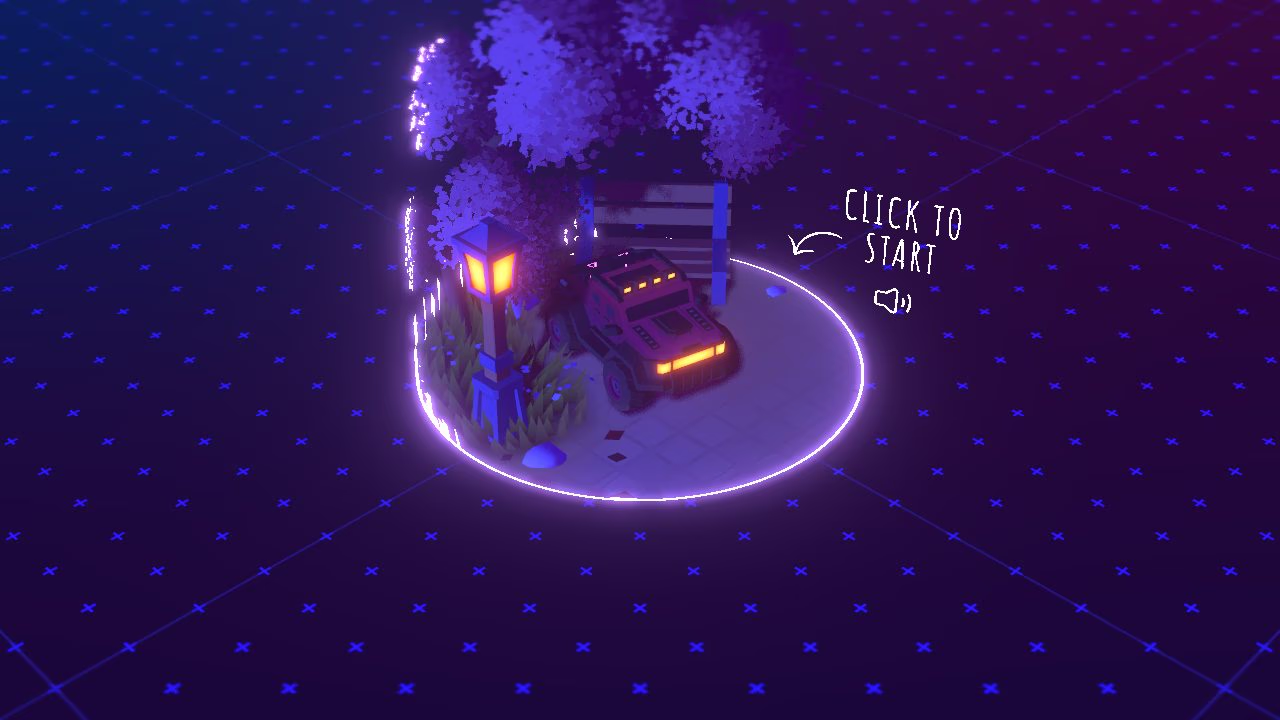
Bruno Simon: a portfolio you drive
Bruno Simon’s portfolio is a small 3D world with a car in it. You drive around with the keyboard, push objects, and find his projects and links as places on the map. It is built with Three.js and Blender, and Awwwards named it Developer Site of the Year for 2019.
What to steal: a clear “click to start” gate. Sound and heavy assets wait for a deliberate action, which keeps the first load honest and avoids autoplay audio.
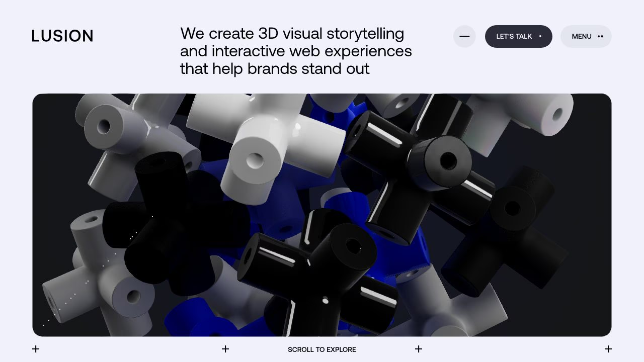
Lusion: 3D that explains what a studio does
Lusion opens with a rounded frame of tumbling 3D shapes and the line “Scroll to explore”. An earlier version of the site, Lusion v3, won Awwwards Site of the Year and Developer Site of the Year for 2023. The studio describes itself as a 3D and interactive web studio, and the homepage works as its own proof of concept.
What to steal: the 3D scene lives inside a framed card instead of taking over the whole page, so the navigation and the headline stay readable on top of it.
Igloo Inc: a whole company as a 3D place
Igloo Inc drops you into a snowy landscape with a glowing igloo and lets you move through it. It was built by the studio Abeto and won Awwwards Site of the Year for 2024. An Awwwards jury member praised the way it combines an immersive scene with simple scroll navigation.
What to steal: a simple, familiar control (scroll) driving a complex scene. Visitors never have to learn an interface.

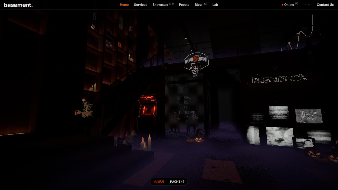
basement.studio: a room with a Human and Machine switch
The basement.studio homepage is a dark 3D room full of small details: an arcade cabinet, a basketball hoop, screens, a dog. A “Human / Machine” toggle at the bottom switches the view, and the site’s menu stays plain text across the top, so navigation never depends on the 3D scene.
What to steal: the real navigation is ordinary HTML links, with the 3D scene as an extra layer on top.
Immersive Garden: restraint as a statement
Immersive Garden greets you with a pale, sculpted relief of flowers and birds and a single line, “Innovative digital experiences studio”. Almost nothing competes with the artwork: a Menu link, a “See all projects” link and a scroll cue. The effect is calm, which is rare among showpiece sites.
What to steal: one strong visual, three small controls. Interactivity does not have to mean clutter.

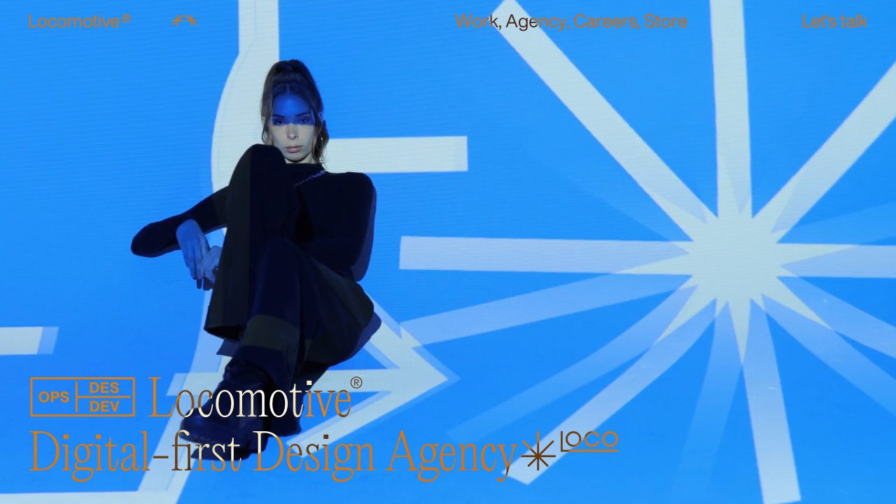
Locomotive: type and video that carry the page
The Montreal agency Locomotive leads with full-bleed video and oversized serif type. It also maintains Locomotive Scroll, an open-source library for smooth scrolling and viewport detection that is now built on Lenis, so the agency’s own taste shows up in tools you can use.
What to steal: type does half the animation work. A confident headline over motion beats a busy scene.
Cuberto: a conventional layout with motion in the details
Cuberto is a useful counterexample to the 3D worlds above. The hero is a centred headline, a short description, one clear contact button, and a large rounded media block below. It reads in seconds, and the movement sits inside the media, not in the layout.
What to steal: keep the structure predictable and put the spectacle in one contained area.

The Pudding: scroll storytelling with data
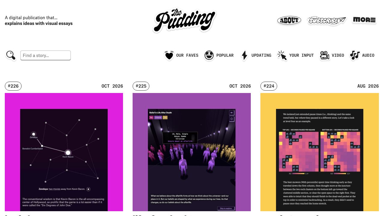
The Pudding is a digital publication that explains ideas through visual essays, run by a small collective since 2017. Each story is its own interactive piece: a network of film connections, a crowd of 3D figures sorted by belief, a heat map of game play. The text leads, and the graphics change as you scroll.
What to steal: the interaction answers a question. Every chart moves because the argument needs it to.
Apple AirPods Pro: product storytelling with a pause button
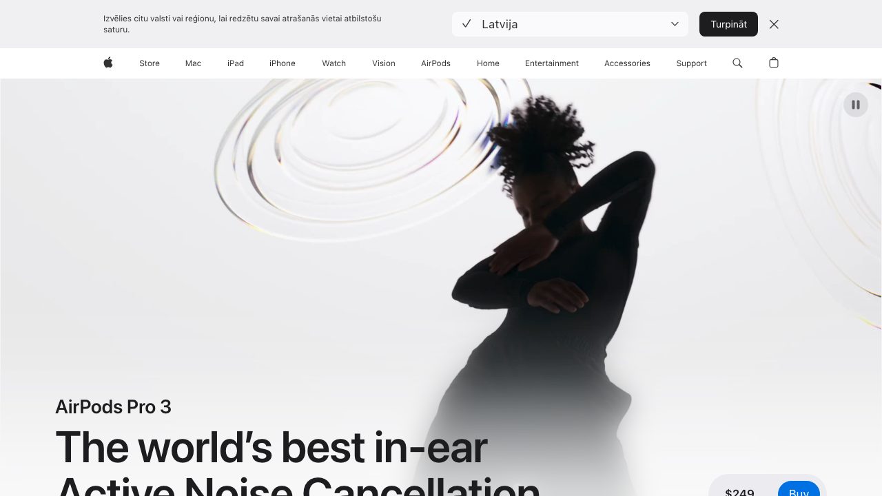
Apple’s AirPods Pro page is the mainstream version of the same ideas: a large motion-led hero with tight typography and a clear buy button. Look at the top right of the hero: a visible pause button for the background video. It is a small control that gives people a way to stop motion, which is exactly the kind of detail the showpiece sites often skip.
What to steal: if motion plays automatically, give people a way to stop it.
The techniques behind them
| Technique | Seen on | Use it for |
|---|---|---|
| Real-time 3D (WebGL, increasingly WebGPU) | Bruno Simon, Lusion, Igloo Inc, basement.studio | Showpieces, product viewers, brand worlds |
| Smooth scrolling and viewport triggers | Locomotive | Pacing a long page |
| Scroll storytelling | The Pudding, Apple | Explaining, selling, teaching |
| Restrained hero plus real HTML navigation | Immersive Garden, Cuberto, basement.studio | Everything that must be found and indexed |
Build the scroll part with CSS
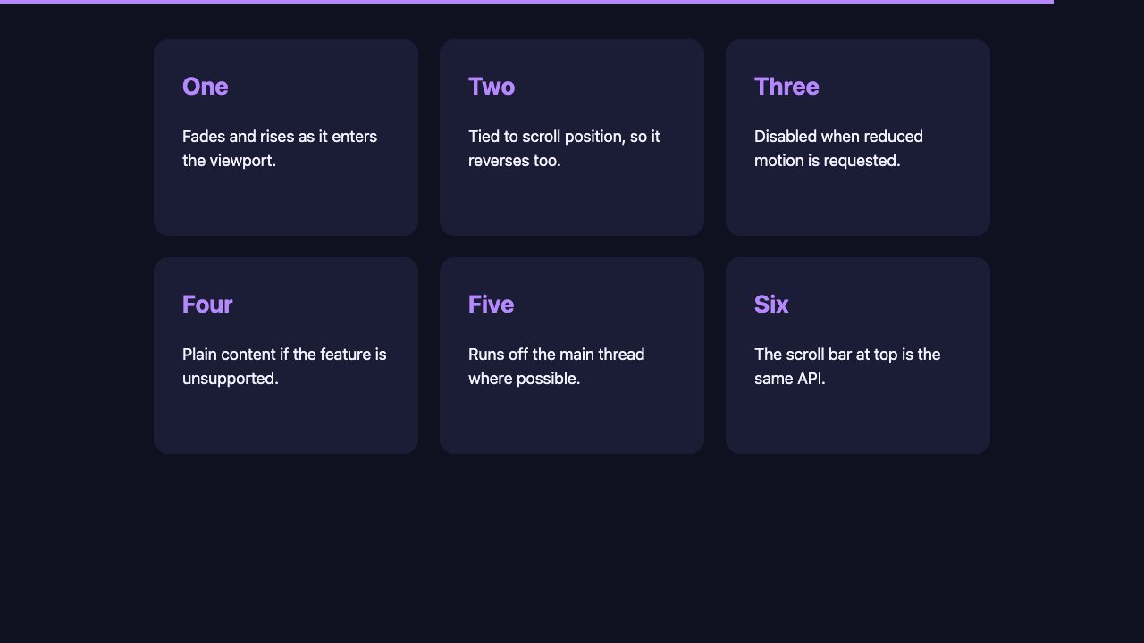
You do not need a library for most scroll-linked effects any more. Scroll-driven animations tie a CSS animation to scroll position instead of time. This example reveals cards as they enter the viewport and draws a progress bar across the top, with no JavaScript and no IntersectionObserver.
@media (prefers-reduced-motion: no-preference) {
  @supports (animation-timeline: view()) {
    .progress {
      animation: grow linear both;
      animation-timeline: scroll(root block);
    }
    .card {
      animation: reveal linear both;
      animation-timeline: view();
      animation-range: entry 0% entry 60%;
    }
  }
}

@keyframes grow {
  to { transform: scaleX(1); }
}

@keyframes reveal {
  from { opacity: 0; translate: 0 3rem; scale: .96; }
  to   { opacity: 1; translate: 0 0;    scale: 1; }
}
Two wrappers do the safety work. prefers-reduced-motion: no-preference means people who asked their device for less motion get the plain page. @supports (animation-timeline: view()) means browsers without the feature also get the plain page. Scroll-driven animations work in Chromium browsers and Safari 26, while Firefox has been slower to ship them in stable, so this progressive-enhancement shape is not optional. Without it the cards would simply be fully visible, which is the right fallback.
For a deeper look at timing and keyframes, see Easy CSS Animation Using @keyframes. For a scroll effect on a hero image, try How to Zoom Hero Images on Scroll.
Page transitions without a framework
The seamless page changes that impressed people in 2013 needed Ajax and custom history handling. Today a multi-page site can opt in with one rule, in the CSS of both pages:
@view-transition {
  navigation: auto;
}
Navigation between same-origin pages then cross-fades by default, and you can style it through the ::view-transition-old() and ::view-transition-new() pseudo-elements. Chromium and Safari support cross-document transitions; browsers that do not simply navigate normally, so it is safe to add. For single-page apps, document.startViewTransition() does the same job for DOM changes.
What the old list taught us, and what it got wrong
The 2013 version celebrated sites that loaded all of their content with Ajax and produced a blank page without JavaScript, and it called out that flaw even then. That problem is still the main way interactive sites fail. The sites above that handle it best keep real links and real text in the page and layer the spectacle on top.
It also admired frame-by-frame animation built from hundreds of images and a 2.5 MB animated GIF. Today the same ideas run from video, compressed 3D models or CSS, at a fraction of the weight. Spectacle still costs bytes. It is just easier to budget for.
A checklist for your own interactive site
- Put real content in the HTML. Headlines, links and text should exist without JavaScript so search engines and screen readers get them.
- Honour
prefers-reduced-motion. Offer a calm version, not just a slower one. - Give a way to stop motion. A pause button on looping video is a small cost and a real kindness.
- Gate heavy assets and sound. A start screen, as Bruno Simon’s site uses, lets people choose.
- Test on a mid-range phone. A 3D scene that runs on a developer machine can struggle on a modest device.
- Keep the keyboard working. Focus must be visible and every control reachable.
More inspiration on Web Designer Wall
If you want ready-made interface pieces to build from, try the animated menu with sliding indicator, the parallax tilt cards or the page header with section transitions. Our other roundups cover parallax scrolling sites and interactive sites built with CSS and JavaScript.


I love where websites trends are heading. It’s a very exciting time for web designers – again. Responsive themes for mobile, interactive themes, etc bring web design back to life in my opinion. Thanks for the gallery of pics!!
Awesome Post! I love the REI 1440 site! That is a really creative way to do their website that really works. I am glad you’re not “dead” LOL. I have always been a big fan of your site and I am glad to see a new post!
I love the list and especially Anonymous – super creative. All the sites are cool and inspiring, but as a professional I understand that SEO unfriendly is a very bad diagnosis today – as such beautiful sites would not be found by many people – hope with html5 and other innovations we will see more interactive and SEO firendly site, that would be easy ot find in Gooogle
Some great sites here. Except for this one: Coffee Surfing illy.
It scrolls too fast and each section is counted as a different page. Leads to annoying navigation problems and no way I saw to pause it. If you scroll with the mouse it seems to speed it up, too.
Was a long time We missed your blog posts.
This list is really inspiring. I really enjoy the parallax scrolling sites with animations. Peugeot Hybrid4 and Life of Pi are my favorites because they use parallax scrolling to tell a story, and it must have taken a long time to plan and make them. Minimal Monkey is great too for a different reason: it’s simple yet effective. It takes a different approach to how blog posts are presented from the usual. The navigation is great and well thought out.
Is it only me who thinks that the sites no matter how awesome and eye candy they are but when they start the loading they fail to serve the very basic function of having a website.
I would be honest i closed my browser window then the loading reached 20% for the website mentioned above ” Coffee Surfing illy “
I think so too. Most of these sites show very well what can be done technically, but from a users point of view they are a nightmare to navigate. Loading times of several ten seconds drive most visitors away anyway before any content can be seen. I think it’s allways been like this when new new technologie becomes available: it is way overused at first. Later when the exitement has settled a little we start to build usable websites again with our new technologie applyed sparingly in places where it is of real advantage…
Wow, superb blog layout! How long have you been blogging for? you made blogging look easy. The overall look of your website is magnificent, let alone the content!. Thanks For Your article.
Just forgot to share this one, happy scrolling :)
This is very nice and helping post for web designers. Those web sites are unique inspiring and containing feature bale. We learn from those websites that helping us in our professional field.
That REI site is amazing! I think the best sites here are the ones that do a beautiful job of integrating data with design, making it a truly interactive experience.
Some of these websites catch my eye and look quite wonderful. I love the creative idea of the New York City website and the moving vehicles.
It is quite obvious there has been a lot of work put into theses websites and they offer high quality design inspirations.
Thanks for the post.
I’d have to say Tinke is my favorite. That’s an incredible experience as you move through the page.
Oh my goodness! Impressive article dude! Many thanks, However I am experiencing problems with your RSS.
I don’t understand the reason why I am unable to join it. Is there anybody getting identical RSS issues?
Anyone who knows the solution can you kindly respond? Thanks!!
The RSS url is and should work with most readers or sites/apps like Feedly.