Design a Watercolor Effect Menu With CSS and SVG Filters
You can build a watercolor-effect menu with plain CSS and two small SVG filters: a paper card with a torn edge, and a loose pink, blue or yellow wash that blooms behind each link on hover and focus. There is no Photoshop file, no sliced images and no JavaScript, and the menu stays real, selectable, translatable text.
This replaces the original 2007 approach, where you painted the menu in Photoshop, exported every state as a bitmap and swapped them with sliced backgrounds. Each of those images was fixed-size, invisible to screen readers and slow to change. Here the “paint” is generated by the browser, so a new link or a new color is one line of CSS.
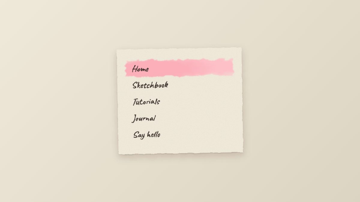
How the effect is put together
Every layer of the Photoshop version has a CSS or SVG equivalent:
| Photoshop step | Today |
|---|---|
| Cut out notepaper, add drop shadow | A card with box-shadow and an SVG displacement filter for the ragged edge |
| Paper texture stock image | An inline SVG feTurbulence noise tile, multiplied into the card |
| Soft 10% pencil washes | Overlapping radial-gradient() layers distorted by a second filter |
| Multiply blend mode | mix-blend-mode: multiply |
| Handwriting font from a download site | A web font such as Caveat from Google Fonts, with a cursive fallback |
| Separate mouseover image | A :hover and :focus-visible state on the same link |
Both mix-blend-mode and feDisplacementMap are Baseline widely available, so none of this needs a fallback to work in current browsers.
1. Markup: a normal navigation list
Start with the most boring HTML you can. The watercolor is purely presentational, so the menu is an ordinary nav with a list of links, and aria-current="page" marks where you are.
<nav class="watercolor-nav" aria-label="Main">
  <ul>
    <li><a href="/" aria-current="page">Home</a></li>
    <li><a href="/sketchbook/">Sketchbook</a></li>
    <li><a href="/tutorials/">Tutorials</a></li>
    <li><a href="/journal/">Journal</a></li>
    <li><a href="/contact/">Say hello</a></li>
  </ul>
</nav>
2. Two SVG filters
Put this once anywhere in the page body. It draws nothing itself; it only defines filters that CSS can point at with filter: url(#id).
<svg width="0" height="0" aria-hidden="true" focusable="false" class="svg-defs">
  <filter id="rough-edge" x="-5%" y="-5%" width="110%" height="110%">
    <feTurbulence type="fractalNoise" baseFrequency="0.04" numOctaves="3" seed="4" result="n"/>
    <feDisplacementMap in="SourceGraphic" in2="n" scale="6" xChannelSelector="R" yChannelSelector="G"/>
  </filter>
  <filter id="bleed" x="-20%" y="-40%" width="140%" height="180%">
    <feTurbulence type="fractalNoise" baseFrequency="0.03 0.08" numOctaves="4" seed="9" result="n"/>
    <feDisplacementMap in="SourceGraphic" in2="n" scale="18" xChannelSelector="R" yChannelSelector="G"/>
    <feGaussianBlur stdDeviation="1.2"/>
  </filter>
</svg>
Both filters work the same way. feTurbulence generates smooth fractal noise. feDisplacementMap then shifts each pixel of the source by an amount taken from that noise: the scale value sets the maximum push, and xChannelSelector and yChannelSelector choose which noise channels drive the horizontal and vertical movement. A small scale (6) roughens the card edge slightly. A larger scale with a stretched baseFrequency (18, wider than it is tall) turns a clean gradient into a streaky, uneven brushstroke. The seed attribute lets you pick a different, repeatable pattern.
3. The CSS
First, keep the filter definitions from taking up space with a tiny rule: .svg-defs { position: absolute; }. Then add the menu styles.
:root {
  --paper: #f6f1e4;
  --ink: #3b2f2a;
  --wash-1: oklch(0.82 0.1 10);
  --wash-2: oklch(0.85 0.09 200);
  --wash-3: oklch(0.88 0.1 95);
}

.watercolor-nav {
  position: relative;
  isolation: isolate;
  width: min(100%, 22rem);
  padding: 2.5rem 2rem;
  background: var(--paper);
  color: var(--ink);
  box-shadow: 0 1px 2px rgb(0 0 0 / .2), 0 10px 24px rgb(60 40 20 / .18);
  rotate: -1deg;
  /* torn, uneven edge */
  filter: url(#rough-edge);
}

/* paper grain */
.watercolor-nav::before {
  content: "";
  position: absolute;
  inset: 0;
  z-index: -1;
  background-image: url("data:image/svg+xml,%3Csvg xmlns='http://www.w3.org/2000/svg' width='240' height='240'%3E%3Cfilter id='n'%3E%3CfeTurbulence type='fractalNoise' baseFrequency='.8' numOctaves='3' stitchTiles='stitch'/%3E%3CfeColorMatrix values='0 0 0 0 .35 0 0 0 0 .25 0 0 0 0 .15 0 0 0 .35 0'/%3E%3C/filter%3E%3Crect width='100%25' height='100%25' filter='url(%23n)'/%3E%3C/svg%3E");
  mix-blend-mode: multiply;
  opacity: .5;
  pointer-events: none;
}

.watercolor-nav ul { list-style: none; margin: 0; padding: 0; display: grid; gap: .25rem; }

.watercolor-nav a {
  --wash: var(--wash-1);
  position: relative;
  display: block;
  padding: .45rem 1rem;
  font: 600 1.9rem/1.2 "Caveat", "Segoe Print", "Bradley Hand", cursive;
  color: inherit;
  text-decoration: none;
  isolation: isolate;
}
.watercolor-nav li:nth-child(3n+2) a { --wash: var(--wash-2); }
.watercolor-nav li:nth-child(3n+3) a { --wash: var(--wash-3); }

/* the wash: soft overlapping radial blobs, multiplied into the paper */
.watercolor-nav a::before {
  content: "";
  position: absolute;
  inset: -.1rem -.2rem;
  z-index: -1;
  background:
    radial-gradient(60% 90% at 25% 55%, var(--wash) 0 55%, transparent 100%),
    radial-gradient(55% 80% at 75% 45%, color-mix(in oklch, var(--wash) 80%, white) 0 50%, transparent 100%);
  filter: url(#bleed);
  mix-blend-mode: multiply;
  opacity: 0;
  scale: .85 .6;
  transition: opacity .35s ease, scale .45s ease;
}

.watercolor-nav a:is(:hover, :focus-visible)::before,
.watercolor-nav a[aria-current="page"]::before {
  opacity: .9;
  scale: 1;
}
.watercolor-nav a:focus-visible { outline: 2px dashed var(--ink); outline-offset: 2px; }

@media (prefers-reduced-motion: reduce) {
  .watercolor-nav a::before { transition: none; }
}
Load the handwriting font before this stylesheet, for example <link rel="stylesheet" href="https://fonts.googleapis.com/css2?family=Caveat:wght@600&display=swap">. If it fails to load, the fallback stack still gives you a script-style face on most systems.
Why it works
The wash lives on a pseudo-element
Filtering the link itself would also distort and blur the text. By drawing the paint on a::before with z-index: -1 and giving the link isolation: isolate, the wash gets its own filter and sits behind the lettering, which stays crisp.
Multiply is what makes it look like paint
Real watercolor is translucent: paper grain and pencil lines show through. mix-blend-mode: multiply darkens whatever is below instead of covering it, so the grain from the card shows through the pink. Blend modes only see their backdrop within the same stacking context, which is why the card has isolation: isolate too; without it the wash would also multiply against the page background behind the card.
OKLCH keeps the three washes balanced
The washes are defined in OKLCH with the same lightness and similar chroma, so the pink, blue and yellow read as equally soft. The second gradient layer uses color-mix(in oklch, ...) to lighten each wash toward white, giving the bloom a paler edge without extra variables. If you are new to the colour space, our walkthrough of simple CSS image filters covers the related filter functions.
Hover and keyboard share one state
The wash opens on :hover and :focus-visible, so keyboard users get exactly what mouse users get, plus a dashed outline as a clear focus indicator. Animating only opacity and scale keeps the transition cheap, and the prefers-reduced-motion block removes it for people who ask for less movement.
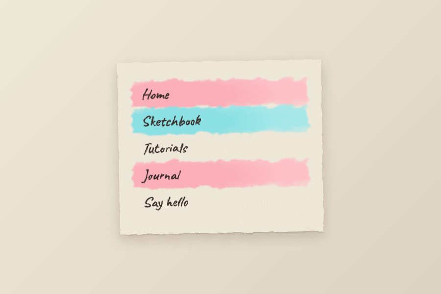
:nth-child(3n+2) and 3n+3.Accessibility and performance notes
- Contrast. The ink color is dark brown on pastel washes, well above the 4.5:1 minimum. If you darken the washes, recheck contrast on the washed state, not just the paper.
- Focus. Never rely on the wash alone to show focus. Keep the outline.
- Cost. SVG filters are rasterised by the browser. Applying
#rough-edgeto a small card and#bleedto a few hover-only pseudo-elements is fine; avoid applying them to full-page containers or dozens of animated elements. - Static fallback. If a filter fails, the gradients still render as clean soft stripes, so the menu degrades gracefully.
- Pointer events on the grain. The grain layer has
pointer-events: noneso it never blocks clicks.
Why not just use an image?
You still can, and a hand-painted PNG will always look more authentic than a filter. But a bitmap menu cannot be resized to a longer label, cannot be translated, does not adapt to dark mode and costs a request per state. The CSS version trades a little painterly accuracy for a menu you can edit in a text editor. A good compromise is to use a real watercolor texture as a background image on the paper card and keep the filters for the hover washes.
Make it your own
- Change the
--wash-*variables to match your brand, keeping lightness around 0.8 to 0.9. - Raise the
scaleon#bleedfor wilder, more splattered edges, or lower it for a tidy marker look. - Change
seedvalues so every link does not share the same brushstroke shape. - Drop the rotation and torn edge for a cleaner variant that suits a studio or portfolio.
If you want other menu patterns to compare, see the gooey floating menu built with an SVG filter, the pure CSS and SVG leaf navbar, and the radial pop-out navigation. For the transition side of hover effects, read Easy CSS Animation With Transition & Transforms, and for how colors combine under blend modes see Spotify colorizer effects with CSS blend modes. On mobile, remember the usual rules in four elements of mobile-friendly responsive menus.


The best tutorial ever! Thanks!
Did you scan the coffee stains or made them in illustrator?
By-the-way, are you going post your opinions on Leopard, in your blog or here. I would love to hear.
Rerally wonderfull… It alway seems to be so simple when I reed you tutorial. And it ‘s never the same whith MY Photoshop… :)
Nick – I actually just posted a breakdown of WDW’s design before you published this one, since one of my readers requested it.. I love this “tutorial” and I believe it will truly shed some light on the finer techniques you’ve used here! Well done!
NIce tutorial!
Although I usually tend to draw on real paper first, scan it and then compose my layers in photoshop. It works nicely for me, but creating everything in photoshop might just be a little faster…. Gotta ‘try’ that next time.
Nicely done. When you say “Find some coffee stain images” perhaps you can point us to a resource? I guess I’ve never stumbled upon any images like this.
Thanks!
I love you. thanks
Your site appears to be an excellent execution of an amalgamation of many design elements found today,, i think we will see more ‘tactile’ style sites poping up soon. urs is definately one of the best
I am never short of amazed when I read your stuff. It is extremely cool! I will have to add a link to your site on my own…. or do I be selfish and keep you a secret from me so called ‘e-friends’.
Finally the long awaited secrets reveals.. Ha! Ha! Nice one Nick!
Now everybody who knows how to use photoshop would love to give it a try I must say.. Thanks for sharing!
Sick and tired of 80 percent of the PS tutorials I find being written using a mac. Wtf is command click, atleast do it with a 2 button mouse on the mac so the people that use real machines and not toys grasp it too. Fact of the matter is, PS runs better on the PC than tha mac, so why even waste your time with the outdated hardware.
i need to second that, sultan, you have no idea what you’re talking about.
The sultan is not the idioma, but he is Saddamme
Does it matter whichmachine runs photoshop more efficiently? Surely phrasing the comment in a nicer way would help others? No need for arguements, why not just ask Nick to transfer the keyboard commands for the pc? Silly.
Sultan – in the above tutorial, and most other PS tutorials, ctrl-click is the same as cmd-click.
your a design pimp for this tutorial. too bad now everones gonna go out and replicate it.
benwa
Hi
Because it`s good for design and it`s free for use :)
And this is samo Comming Soon page :)
you well see when a site be on-line :)
im having trouble downloading the file…it finished not even halfway through….anybody else have any luck?
strange…i just tried it in Safari and it worked.
i was using Firefox.
I could not open the file after I downloaded the file in FireFox and IE but it works with Opera broswer! Also, thanks for sharing this beautiful photoshop trick.(:
wow! That looks absolutely amazing! I’ve always loved your site designs, and when you are as creative and as skilled as that, there is no wonder your designs are so good.
I’ll definitely be giving this a go for a theme design I have in the pipeline!
Thanks so much, a new RSS subscriber!
Excelent… Thanks to your advice I can redesign my blog. Tank you very much again and please visit my blog in http://www.ferchovich.blogspot.com and please tell me about it
MUY BUENO!!!!!!.. la verda me encanto!.. y soy el primerop q firma en castellano… te felicito y te agradezco por compartir ese conocimiento…
Va en ingles… Very goood!!! eee!!.. big Work!! jajajaja.. great web site.. i dont speak inglish! but i love this tutorial.. be happy bueno se se mucho mas en ingles Pero se agradece de verdad!
Love it. I’ve used some of these techniques in my website http://www.kymhuynh.com so thank you for being such a amazing inspiration! For the longest time, I wanted to turn the website into something that reflects me – my online persona… and I think this is one step closer
Just used this tutorial and It was an amazing help, Will be using this style on my new site soon. My favourite part? The rings around the items. :)
Great tutorial!! I’m really starting to get to grips with tools in photoshop after this!
is it possible to get a low cost version of the most uptodate photoshop. and a tablet. i know im asking allot. but does any one know where. or have one of them. PM me if you do on my youtube name w2willyjeep.
That’s spectatular webpage. I really adore your design skills. Thanks a lot for inspiration and big motivation to work on my skill set :)
i love it!
I’m now student Graphic design and i never seen any like this! Hope to make some like this one day.
Keep up the good work!
Absolutely the most valuable tips and tutorials ever!
waha, :D photoshop & illustrasror .
Best partner to designing.
This is just great, and I love this forums theme too!!!
Great job done, and thanks a ton for the tutorial!
You’re veeerrry creative!
Smart and efficient web design!
Thank you for the wonderful tutorials-they are presented sooooo well- and – thank you for the links to other useful sites!
Great Job!
Very? very creative! I will use this technique. Thanks a lot…
when you can in your artwork, what resolution do you do it at? 300 dpi? and then set the background to transparency? thanks!
ekdum jhakas, this means fantastic dude.
u r quite illustrative friend,
its good that u present ur work with tutorials 2 the world,
its really helpful to us- {new designers}
thanx a lot for tutorials.
please in the second stpe of the tutorial how do you get “layer 2” to have a white fill.i have tried several times to change the fill but the checker boxes are permanent. in step 2 picture 2, the notepaper has color on it but the white layer it is on doesn’t .How do you acheive that.
Seen something like this before…
Used this on a comp of my home page – worked great
with my logo – really gives an artsy side to those trying to apply a creative edge to some static contemporary work.
Good way to give an Aged look too!
suweet! this is awesome man.
great technique, i’m going to try that now.
brilliant works btw.
Thank you so much for a wonderful site. I’ve been wanting to learn CSS and your site is a great resource. I intend to add your link to my artist’s resource blog for other artists to benefit from your expertise!
I really like this site and it has inspired me in many ways. Keep up the great work!
Good wishes! What happened to march network jtpov
I used only the css code for my header. Just tweaked the code a little and got a very good header going. Thanks much! :)
i cant coding css.but i will work it after the learn
gracias en realidad si me ayudo mucho con lo que andaba buscando seguire visitando la pag!! es muy interesante y funcional!!! =)
I love it..!
Amazing articles for adding cool effects to all my design work.
Well, can I use this stock?
it’s PERFECT.
Quality works require skills like you…Great Work Man!
This is pretty awesome! Thanks for putting it together! By the way, what is the name of the font that you use?
you should use this in your website,
it def matches well lol.
Great tutorial! I especially like the “wrinkle effect” in step #3 using the gradient. That little detail really makes the paper for me.
I found some great coffee stain images at StockXpert. The photographer even has vector versions for you Illustrator buffs:
What’s great about these pastel designs is that the site has a wonderfully subtle texture while still providing visual “room” for exciting imagery that can draw the eye of the consumer. Too many sites seem to be using aggressive designs that can literally exhaust viewers. Nothing seems exciting after awhile on these sites.
With pastel ideas like this, the web-developer can create a dynamic page design without bludgeoning the viewer with excessive color and imagery.
Thanks for posting and looking forward to more!
Excelente trabajo, sin lugar a dudas sabes lo que haces
Te felicito Por ello, y vere que puedo aprender de ti….
thank you =]
gracias que buen trabajo lo pondre a paractica *o*
thnx.. nice
but i didn’t understand how to do this step
” Cmd + click on the notepaper layer to load the selection ”
so what is cmd ??
CMD+Click I think it should be command + click (MAC) or you can use Ctrl+click (PC) <—not sure coz I am just a newbie for ps
Yeah cmd is for the mac for pc it is ctrl. Photoshop is more made for the Mac.
what dumm-ass.. its not made for MAC.. LOL.. it works exactly the same if you do it with windows you dumm-ass. Mark your stupid idiot!
Yeah, omg what a stupid idiot. Mark, its made for both. You can choose to download it for the MAC or for WINDOWS, you stupid dumm-ass!!
Children, children… Off course PS is made for both Mac and PC but what Mark meant is that Photoshop works better on a Mac, those computers are more designed for graphic programs. So he is absolutely right.
love the water color effect.
photoshop can be used to its fullest capacity in both pc and mac. absolutely nothing is different.
macs are used by filmmakers, graphic designers, etc… because they are much faster and the OS is less prone to errors. efficiency.
mac, ftw.
Hmm, the menu looks cool, but it’s not accessible when images are turned off.
very nice tutorial…..
i love it and your way of creating layout…
hahah.. i love the brushes you used…
keep on posting!
The designs showed here show what simple and tasteful design is all about. Another one to consider
Your web is very unique and authentic , very nice and basic. So I like it. I think ur prety girl, please sent me your photos….
Perhaps I like you too….he…he…he…
Are you maried?
But I give you suggestion please shrink download file with winzip so Every one can download fastly.
Hi,
Great , Design color Effect Menu
Your web is very unique and authentic
Great tutorial
thanks
what is your website real price:
free check here
websitereckon.com
Incredible indeed … What level of skill needed for this? It sounds complicated.
Thanks
i was wondering a bout handwriting font that using in the last tutorial about vector effect and i found the answer very fast here :)
i get nice collection from Dafont and thanks for you and for that great tutorial
Very nice work simulating the watercolor effect! Amazing what you can do with a few tools used in the right way……
– Joe
The Christmas time is comming, and the most desire present i want to get, is the latest white iphone 4, can i get one? Tell you after Xmas.
The christmas time is coming, white iphone 4 conversion kit will be the best present for yourself and family.
That is to be expected in a long-term, high-risk project like ours. So, we turned to the blogging community for help – and got it! We have published our problems, and the community responded with results!cheap ugg boots
Design Watercolor Effect Menu post is Amazing post .
This is really fantastic advice, thank you so much….
If you want to earn money online and become a freelancer so Click.
Training For Freelancers
Design Watercolor Effect Menu post is Amazing post .
This is really fantastic advice, thank you so much….
Excessive fear, anger, and work under stress last pregnancy, infants can lead to excessive hassaslığa. Intense emotions, going through the mother’s blood circulatory system and brain functions that affect the baby in some leads to the release of chemical
That is to be expected in a long-term, high-risk project like ours. So, we turned to the blogging community for help – and got it! We have published our problems, and the community responded with results!cheap ugg boots
I don’t suppose I’ve never read something like this before. So good to see somebody with some unique ideas on this subject. I really thank you for starting it. This web site is something that’s wanted on the internet, somebody with a bit of originality.
I don’t suppose I’ve never read something like this before.
now how to make this become alive?
any tutorial on jQuery or Flash implementation of this please
Painting on the tablet is fun, but to do cool things need work.