One of the challenges of coding premium WordPress themes is the unpredictable nature of how they will be used. Compared to coding a custom website, especially one using static HTML documents where you have complete control over the markup, you have to solve problems creatively and ensure flexibility. In these cases, CSS selectors make all the difference.
At Themify, we’ve learned many CSS tricks to code flexible themes that work with most content. In this guide we’ve provided an overview of the most useful css selector techniques, with examples of what they do and how they look in CSS, along with some working demos of how you can put them into practice.
You should already have an understanding of basic selectors like elements, classes and IDs, as we’ll jump straight into the less understood and underused selectors below, beginning with streamlining your forms with pseudo-classes.
Form Styling
Forms can be difficult to implement correctly if you don’t have a good grip on Javascript validation. Thankfully, CSS now provides us with validation pseudo-classes, making it easier to code more lightweight forms without scripting.
Let’s take a look at the examples demonstrated in this form:
:enabled and :disabled
The :enabled CSS pseudo-class represents any element with the enabled attribute. An element is enabled if it can be selected, clicked on or accept text input (or any focus at all). :disabled represents elements with the disabled attribute.
<textarea name="your-message"
id="your-message" placeholder="(your msg here)"
class="expanding" required></textarea>
Using the Edit button on the CodePen demo, here is a little exercise to show you how it works:
Step 1: In the HTML section, add disabled after required:
<textarea name="your-message"
id="your-message" placeholder="(your msg here)"
class="expanding" required disabled></textarea>
Now you won’t be able to click or tab into the message field.
Note: Elements that are designed to take user input, like text fields and textareas, are considered enabled by default, so enabled does not need to be explicitly defined in your inputs from the get-go.
You would only need to use these selectors in CSS when you wish to provide a visual cue (such as graying out a disabled field).
Step 2: Add a style for :disabled in the CSS panel:
textarea:disabled {
  background: #ccc;
}
There is a bit more elegant way of handling this in pure CSS forms:
:read-only and :read-write
An element that can be edited, like a form field, is considered in the read-write state already, just like it is assumed to be enabled. An element that cannot be edited is read-only – which is most non-form elements by default. These pseudo-classes are the most useful in working with forms where a field’s state is being set by JavaScript or some other external source, rather than through something easier to select like the disabled attribute.
Using the same exercise as above, add readonly after required in the textarea HTML:
<textarea name="your-message"
id="your-message" placeholder="(your msg here)"
class="expanding" required readonly></textarea>
The field can still gain focus – you are able to click into it – but you can’t type or edit anything. Compared to :disabled, :readonly is best used in applications where you need to dynamically disable editing of a field. The CSS rule is identical to :disabled:
textarea:readonly {
  background: #ccc;
}
Note: :read-write is the opposite state of :read-only. It is still considered experimental and may be removed from the spec as it offers little improvement over :enabled.
:checked
The :checked CSS pseudo-class selector styles any radio (<input type="radio">), checkbox (<input type="checkbox">) or option (<option> in a <select>) element that is checked or toggled to an on state.
To demonstrate, click the checkbox on the form demo above. We use :checked to give it a special style in this state:
:checked + label {
    padding: .5em;
    color: rgba(236, 181, 62, 0.95);
    background-color: rgba(255, 255, 255, 1);
    transition: .3s;
}
:indeterminate and :default
The :default pseudo-class matches elements that qualify as default in relation to a set that they are part of. For example, you might have four checkboxes, two with the checked attribute. Where :checked or [checked] lets you apply styles specifically to checked items or items that are “on”, a CSS rule using :default will apply that style to items set to checked or on in their default state and allow you to provide different looks for that default state vs user-selected state.
The opposite is :indeterminate, which matches checkboxes, progress bars, and radio buttons with no checked or selected elements in their group.
:required and :optional
These pseudo-classes let you style form elements based on whether they are required to be filled out (:required) or not (:optional).
In HTML, you must have the correct input type, and would set the required attribute:
<input type="text" name="your-name" id="your-name"
 minlength="2" placeholder="(your name here)" required>
Then select it using :required, input:required, [required] or input[required] to do something basic like give it a red border.
:required{
  border: 1px solid #e50e0c;
}
This pseudo-selector is more useful than that, though. It can be used to provide validation feedback when combined with :valid and :invalid:
:valid and :invalid
These pseudo-classes are useful in HTML forms for giving visual clues as to the validity of the data entered by the user, something that would normally be done with JavaScript. The CSS rules are applied to the inputs themselves, with the :invalid styles taking effect when the validation fails. The tooltip and message is provided by the browser, saving you the trouble.
input:required:valid {
  border-bottom: 2px solid rgba(255, 255, 255, 0.2);
}

input:required:invalid {
  color: rgba(255, 255, 255, 0.5);
}
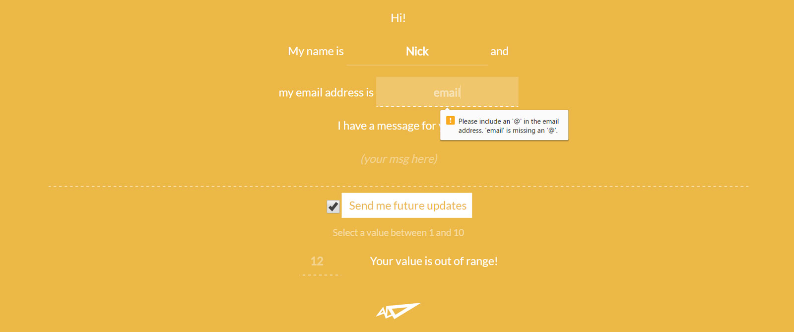
A regular text input type that doesn’t require a specific format is valid by default, but would be invalid without data if it has the required attribute set. To demonstrate, type a few random characters into the email address field of our demo above and click the send icon.
Note: Of course, these don’t work on common elements like div or p because those elements don’t have any way to specify expected data formats.
:in-range and :out-of-range
These two pseudo-classes are useful for form elements that allow data that falls between a specified range. You can style the specified input based on whether or not the element is within the allowed range.
The range is set in the number type input using min and max:
<input id="value1" name="value1" type="number"
placeholder="1 to 10" min="1" max="10" value="12">
<label for="value1">Your value is </label>
Then you style the two states – the browser takes care of the validation:
input:in-range {
    color: rgba(236, 181, 62, 0.95);
    background-color: rgba(255, 255, 255, 1);
}
input:out-of-range {
   color: rgba(255, 255, 255, 0.4);
}
input:in-range + label::after {
    content: 'OK';
}
input:out-of-range + label::after {
    content: 'out of range!';
}
Some notes on these selectors:
- These can be used for
number,datetime,datetime-local,month,week, and any other input types that allow ranges. - Not supported in IE
::-webkit-input-placeholder
Input elements can sometimes show placeholder text as a hint to the user on what to type in. This extremely experimental selector allows you to style the placeholder text in a similar way to using [placeholder] attribute selector, but with more flexibility:
::-webkit-input-placeholder {
  text-align: center;
  color: rgba(255, 255, 255, 0.4);
  font-style: italic;
  font-weight: 400;
}
This pseudo-element is not supported in all current browser versions and has been replaced in the working draft by ::placeholder. Keep an eye on its status here.
:focus
You’re probably familiar with :focus, which can be used to select an element that has been selected with the keyboard or by activating with the mouse – usually form fields. We can use it in combination with other pseudo-classes to style very specific states.
For example, we give the textarea of our form a solid border when it is focused and when valid data is being entered:
textarea:focus {
  background-color: rgba(255, 255, 255, 0.2);
  border: 2px dashed rgba(255, 255, 255, 1);
}

textarea:focus:required:valid {
  border: 2px solid rgba(255, 255, 255, 0);
  border-bottom: 2px solid rgba(255, 255, 255, 0.2);
}
Summary
CSS pseudo-classes like :focus are used to select a specific state or status of an element. Pseudo-classes are predefined in the CSS3 specification for us, so are easy to learn and remember – the trick is knowing which elements to pair them with.
A few notes on specificity:
- Not all pseudo-classes can be used on all elements. For example, the :visited pseudo-class only really applies to links – you wouldn’t use it on an
li. - When using pseudo-classes, it is important to write them after the more dominant selector is styled:
a{}
 a:link {}
 a:visited {}
 a:hover {}
 a:active {}
Considerations
In CSS, using pseudo-classes to select these states may not be as direct as simply using the corresponding attribute selectors:
[disabled], [readonly] {
  background: #ccc;
}
We’ll get into attributes in a bit. First, let’s explore some other things you can do with pseudo-classes to influence elements in your layouts:
Layout
:target
In a case where you have navigation that uses anchor-links, such as a single-scrolling page, the :target pseudo-class lets you style the targeted element a special way when it is actioned using the link.
The anchor can be any element with an id attribute. A URL like http://www.yoursite.com/#about-us targets an element with an ID of cta…
<section id="about-us">…and can be styled like this:
section:target{background-color: #eee;}
When the About Us link is clicked in the nav, it then scrolls to this section and the background color changes.
For example, notice that the background is white when you manually scroll down in the below demo:
Now click the Scroll link to see :target do its magic.
:nth-of-type(n) and :nth-child()
:nth-of-type()
This pseudo-class helps you select specific sibling elements numerically, such as list items inside a ul, sections inside a common parent wrapper, or a series of articles inside a section a shown in our demo:
<section class="posts-wrapper grid-2">
 <article class="post">
  <h3>Title</h3>
  This is a post
 </article>
 <article class="post">
  <h3>Title</h3>
  This is a post
 </article>
 <article class="post">
  <h3>Title</h3>
  This is a post
 </article>
 <article class="post">
  <h3>Title</h3>
  This is a post
 </article>
</section>
Let’s take a look at how :nth-of-type is used to clear floats on specific post counts in a basic grid when using something more practical like flexbox is not possible.
.posts-wrapper.grid-4 .post:nth-of-type(4n+1),
.posts-wrapper.grid-3 .post:nth-of-type(3n+1),
.posts-wrapper.grid-2 .post:nth-of-type(2n+1) {
	margin-left: 0;
	clear: left;
}
It can also be used to change the appearance of the first element in a row:
.posts-wrapper.grid-2 .post:nth-of-type(2n+1) {
	background-color: #a9c9be;
}
or the last:
.posts-wrapper.grid-2 .post:nth-of-type(2n+2) {
	background-color: #96a9b3;
}
:nth-of-type is similar to :nth-child, but is a more flexible and useful pseudo selector if you want to ensure you’re selecting the same type of tag no matter where it is inside the parent element, or what other different tags appear before it (such as a heading).
Figuring out the formula for the value inside the :nth-child() or :nth-of-type() selector’s parenthesis can be a little mind-boggling. To demystify it, lets take a reference from the MDN:
- 1n+0, or simply n, would match every child element. n does not match on Android Browser 4.3 and below whereas 1n does. 1n does the same thing as 1n+0. Feel free to use whichever looks better.
- 2n+0, or simply 2n, would match child elements 2, 4, 6, 8, etc. You can substitute the keyword even for this expression.
- 2n+1 would match child elements 1, 3, 5, 7, etc. You can substitute the keyword odd for this expression.
- 3n+4 would match child elements 4, 7, 10, 13, etc.
Use :nth-child when you need to be super specific. In our demo, we can select exactly the 3rd and 4th articles to apply unique background colors to them:
.posts-wrapper.grid-3 .post:nth-child(3){
  background-color: #96a9b3;
}
.posts-wrapper.grid-3 .post:nth-child(4){
  background-color: #a9c9be;
}
:not
This pseudo-class allows you to essentially negate or remove styling under a specific condition. In WordPress theme styling in particular, :not is extremely useful for applying styling to interior pages and avoiding using a clunky reset for the homepage.
Consider a case where you have a homepage with a full screen slider that needs a transparent header with light text. You need to allow the interior pages to have a light header with dark text, such as Themify Ultra’s Fitness demo. WordPress gives the body element of the homepage the home class, which we can combine with :not like this:
body:not(.home) #header {
	background: #FFF;
	color: #000;
}
:not can be combined with other pseudo-classes, but not pseudo-elements (explained next).
Pseudo-Elements
Just like pseudo-classes, pseudo-elements are added to selectors but instead of describing a special state, they change some aspect of your selected element which can then be styled separately form the element itself. Pseudo-elements are distinguished from pseudo-classes by using a double-colon. They are fairly new to CSS, most still considered experimental.
Below we’ll look at a few supported in current browser versions and how you can implement them:
::first-letter and ::first-line
::first-line targets only the first line of an element specified by the selector.
p::first-line {
  font-style: italic;
}
::first-letter selects the first letter of an element, like a paragraph and is used most often for styling drop-caps as you can see on this post, or on the Themify Infinite theme:
<div class="entry-content">
  <p>Custom excerpt: suspendisse eleifend et diam quis posuere.
 Aliquam eu turpis sed ligula tincidunt lacinia faucibus quis arcu. </p>
</div>
.entry-content > p::first-letter {
    float: left;
    font-size: 6.2em;
    font-weight: 600;
    line-height: .55em;
    padding: .15em .25em .15em 0;
}
When your article has other elements in it before the first paragraph, it can be combined with a pseudo-class like :nth-child():
article p:nth-child(3)::first-letter{
  font-size: 200%;
  font-weight: bold;
}
- ::first-letter only works if the element it is applied to is not preceded by any other content (such as images) on its line.
- A combination of the ::before pseudo-element and the content property may inject some text at the beginning of the element. In that case, ::first-letter will match the first letter of this generated content.
- You can only use some properties with this pseudo-element.
::selection
The ::selection pseudo-element helps you style parts of your page that are highlighted (selected with the mouse, etc by the user).
In this example, the default black highlight in Chrome will be light orange instead when paragraph text is highlighted:
p::selection {
 color: #FFF;
 background: #e68b63;
}
You can only use some properties with this pseudo-element, and the element you pair this with must be the one containing the text. article::selection will not work, for example, if all the article text is inside heading and paragraph elements.
::after and ::before
For a detailed exercise on using ::before and ::after, see How to Add Icon Fonts to Any Element With CSS
Getting Specific
There are more complex ways you can combine or format a selector to make it even more specific.
Selectors based on relationships
Selector formats like article > p , strong + em, and article ~ p help provide a high level of specificity for applying CSS rules to special situations and allow us to build more efficient stylesheets.
Adjacent Selector: +
The adjacent selector type will style the second element only if it directly follows the first one. In our demo example, we can use this technique to apply a specific style to elements with the .image-caption class that directly follow and element with the .image-wrap class to fix issues that occur when an image caption is present, but the image is missing.
.image-wrap + .image-caption {
	width: 100%;
	box-sizing: border-box;
	position: absolute;
	bottom: 34px;
	left: 0;
}
To make the caption text overlap with the image, you would need absolute position. The problem with using absolute position is that it might overlap with other elements when the image isn’t there. To avoid the overlap concern, you can select .image-wrap + .image-caption to apply absolute positioning only if an image is there. This way, the .image-caption element displays normally if no image is present.
In another example, say you have a form field that consists of multiple inputs/labels. You want to add some spacing in between each input, but you don’t want to add wrappers, you can use the same technique. The CSS below will only add margin-left spacing to the input element that is right after the label tag.
.form-field label + input {
  margin-left: 1.5em;
}
Child Selectors: >
Child selectors will not select all elements inside an element (descendants), only direct children. In this example, we have a list of menu links with a child list and only want the main links to have special styling. If we target .menu a, then it will apply the rule to all links in the .menu element. This can cause sub-menu links to inherit this styling and force us to write some ugly overrides. To resolve this problem more efficiently, we can use a child selector so the style applies only to the main menu links, or the first level of links inside the .menu element:
HTML:
<ul class="menu">
 <!--First Level -->
 <li><a href="#">Home</a></li>
 <li><a href="#">About</a>
  <!--Second Level -->
  <ul>
   <li>This is my <a href="#">profile</a>.</li>
  </ul>
 </li>
 <li><a href="#">Contact</a></li>
</ul>
CSS:
  .menu > li > a {
    display: block;
    padding: .5em 1em;
    background: #f5f5f5;
    border-bottom: solid 1px #ccc;
    color: #69C;
    font-size: .8rem;
    text-decoration: none;
    text-transform: uppercase;
    transition: all ease-in-out .3s;
  }
Sibling Combinator: ~
A selector that uses a general sibling combinator matches elements that exist together inside the same parent element. This is indicated with the tilde symbol:
h3 ~ p {
   margin-bottom: 20px;
}
In this example, all p elements will be styled with the specified rules, but only if they are inside an element with at least one <h3>. There could be other elements in between the <h3>and <p>, and the styles would still apply. This selector has really specific use cases, and is best implemented when there is no other way to select something efficiently.
Getting Unspecific: Wildcard Selectors
Wildcards, specified using an asterisk, are the polar opposite of the above selectors and are used to apply styles to a broader scope.
For example, the rule below will remove all margins and padding from everything on the page:
*{
margin: 0;
padding: 0;
}
There is pretty much no reason to ever use this selector this way. The asterisk only becomes useful when combined with other selectors:
header * {
 font-weight: bold;
 color: #FFF;
 text-transform: uppercase;
 letter-spacing: .5rem;
 text-align: center;
 margin: 0;
 padding: 1rem 0;
}
We could have used just header here, but the asterisk ensures the rule is applied to all elements inside the header and saves us from having to define multiple rules or selectors. Note that rules selecting a child element are more specific and will override.
Matching
Finally, there are several ways we can use matching operators to build more efficient rules, though matching is often complicated and not always the fastest. Matching is most often done with attribute selectors. Here is a quick overview of what each operator does and how it looks in CSS:
In this demo, we are using matching to add an icon to links of a specific type. To begin, we use the :before pseudo-element to set the Font Awesome icon font-family. This saves us from repeating it in each individual link type’s rule:
.link-icons a:before {
	font-family: FontAwesome;
	color: #0cc7ef;
	padding: 2px 5px;
	margin-right: 4px;
	border-radius: 3px;
}
a[href^="https://"]
Shown here using an attribute selector, the carat symbol , ^, Specifies what the attribute's value should start with. In this example, it selects all link elements that have a secure URL beginning with https. Using this selector we can add a lock icon next to all instances of those kind of links.
/* https icon */
.link-icons a[href^="https"]:before {
	content: "\f023";
}
a[href$=".pdf"]
The regular expression symbol,$, helps us match what something ends with. In this example, we look for all links with a url that ends in .pdf.
/* PDF file icon */
.link-icons a[href$=".pdf"]:before {
	content: "\f1c1";
}
a[target=_blank]
We can also be exact by selecting links with a target attribute that is exactly _blank.
/* new window icon */
.link-icons a[target=_blank]:before {
	content: "\f2d2";
}
a[href*="webdesignerwall"]
And using our wildcard symbol, we can add a text file icon to any link url that contains "webdesignerwall".
/* article icon */
.link-icons a[href*="webdesignerwall"]:before {
    content: "\f0f6";
}
Other Cases
img[title~="fashion"]
The third method will select space separated instances of a value. This example will select any image whose attribute (in this case "title") contains a space separated list of words - in this case any image with a title that includes the word "fashion".
img[alt|="small"]
The fourth method will select hyphen separated instances of a value. This example will select any image whose attribute (in this case "alt") has a hyphen separated list - in this case any alt attribute that includes "small-".
Summary
In large designs where speed is important, you can make your stylesheets more efficient by avoiding complex rules that depend on relationships between elements. Before using complex selectors, you should ask yourself:
- Is there an existing HTML element or combination that could be used instead?
- Is there a class or id further up the document tree that could be used?
Matching and combinators do have their benefits. If you use these techniques efficiently, you avoid the need to specify class or id attributes on so many tags in your document. Instead, CSS does it for you!
Understanding how selectors work, how to write them and how to choose the best ones will help you level up your coding skills and make use of rapid styling techniques and tools like your browser inspector for more efficient front-end design.
Reference
You can find detailed information on the selectors and cases presented here at the following links:
Tarnya Burge
Thank you for this comprehensive article. I have only done custom themes for specific clients but the idea of creating a premium theme is appealing.
Abegail Louise Acosta
Awesome! This is great for newbies like me working in a professional website development company.